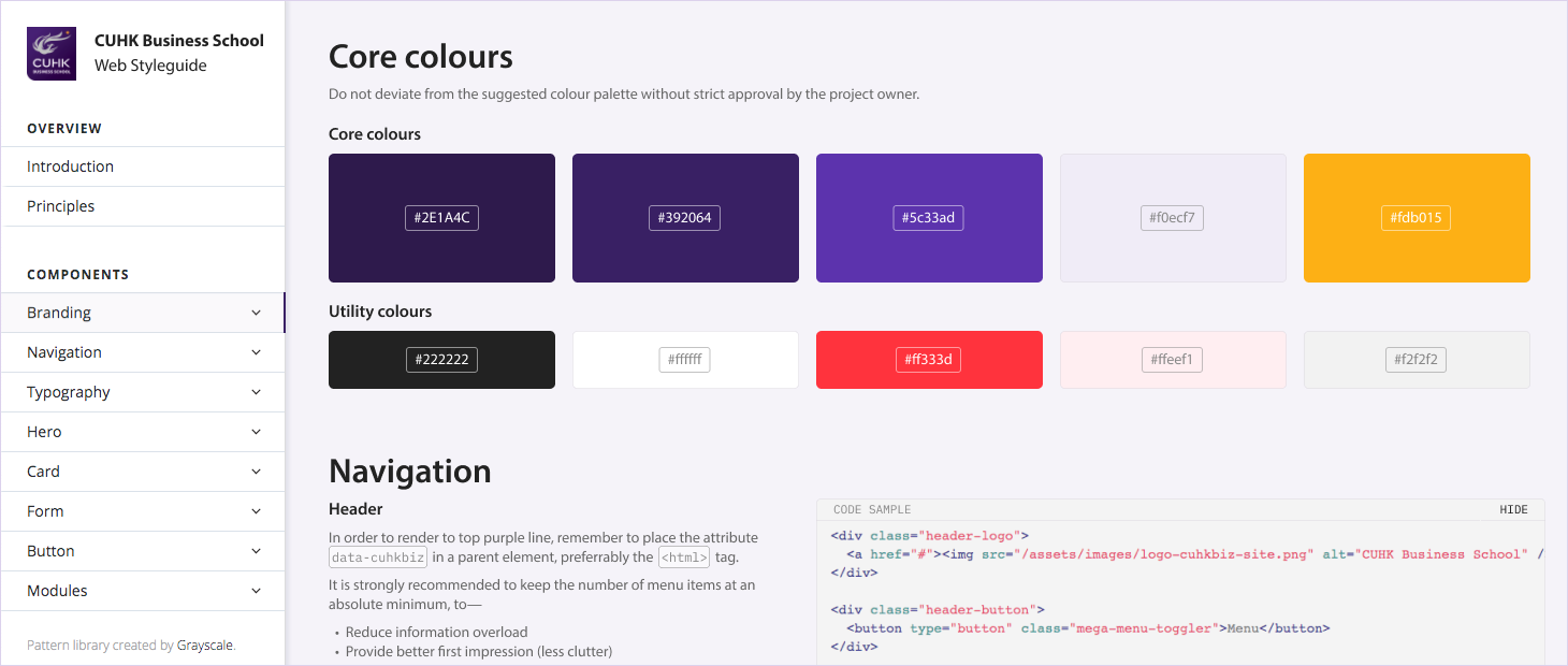
Projects
Simple solutions to complex problems.
Hinrich Foundation
Lanson Place

Silverhorn Investment Advisors

St John’s Cathedral Counselling Service
Cathay Pacific

HKU’s The Pilgrim’s Guide

AURA.works
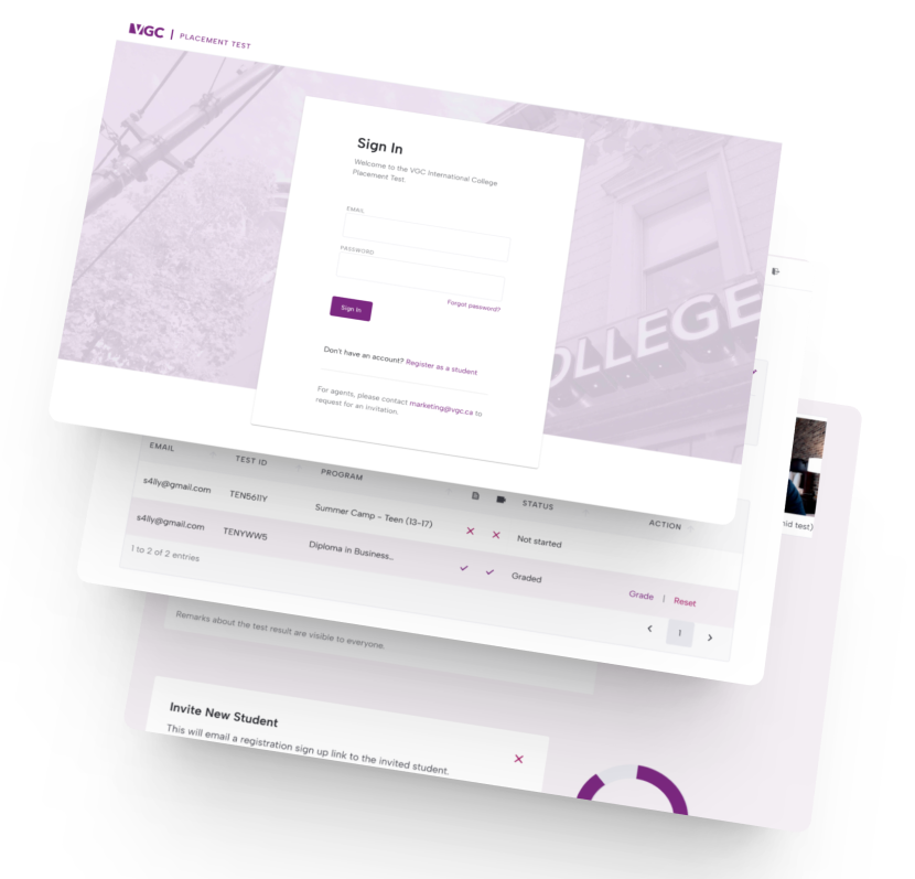
VGC International College
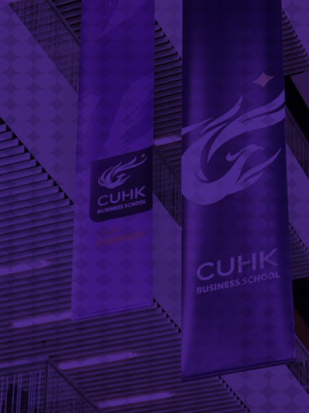
CUHK Business School
Boase Cohen & Collins
Branding • Website Design • Website Development
Boase Cohen & Collins (BC&C) is a law firm from Hong Kong offering professional legal services with a personal touch since 1985. Grayscale helped update their brand identity and create a website that represents their professionalism, impartiality, and versatility.
CityU
3D & Custom Illustration • Website Design
CityU is one of Grayscale’s long-term clients. We have designed a few websites for them including the College of Business and Department of Physics.
CRAFT
3D & Custom Illustration • Website Design • Website Development
Specialising in industrial-scale façades, roofs, and interiors, Grayscale worked with CRAFT to showcase their company culture and extensive project history.
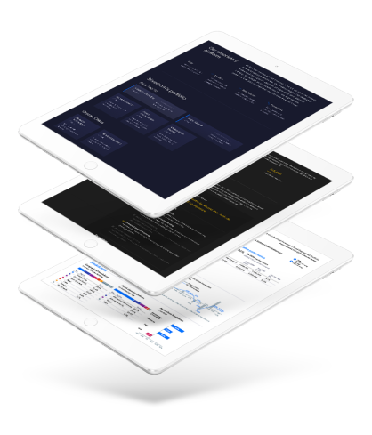
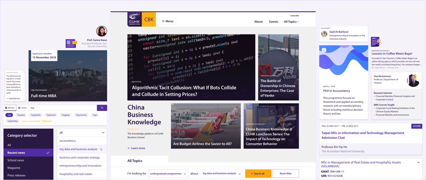
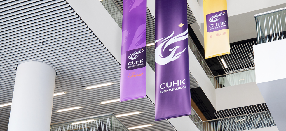
CUHK Business School
Website Design • Website Development
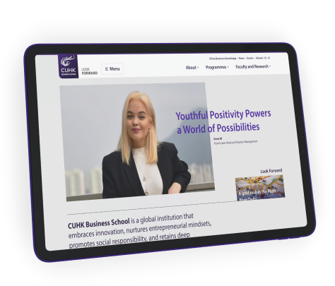
CUHK Business School
Looking forward to a new business school experience
Following a radical rebrand earlier in the decade, this growing faculty needed to apply that branding in a unified way across its varied programme sites, all while balancing internal communication objectives with inspiring success stories.

Client Location
Hong Kong
industry
Tertiary education
Scope of work
Web design & development
User research
site link
the brief
Planning a unified platform
With an ever-growing amount of programmes and content to manage, the team was looking for not only a new suite of websites, but a comprehensive design system to guide development even further into the future.
A recent brand analysis had informed the school that key communications objectives were not being picked up by their target audiences, and that substantial opportunities for organic growth were being missed.
In addition, Grayscale identified that their current web design, while closely aligned with their print collateral, was showing signs of age and not optimised for mobile. The last point being a serious cause for concern since 25% of all traffic was coming from such sources—and showing an alarmingly high bounce rate!

research
Focus group feedback
To ensure the site truly meets the needs of all visitors, we conducted focus group meetings and one-on-one interviews with both incoming and current students from undergraduate, masters, and MBA programmes.
From these meetings, we found that students were unsurprisingly hyper-focused on the application process, a rather byzantine task on the existing site. While a redesign of that was not within the scope of the project, we made sure our design system provided clear pathways to get there.
The interviews also shed light on some secondary stakeholders, specifically parents of undergraduates, who we discovered were often more comfortable reading material in Chinese. Since a full multilingual site was out of scope, we instead planned out a condensed Chinese site focused on programme details and the application process—the most vital information for parents.
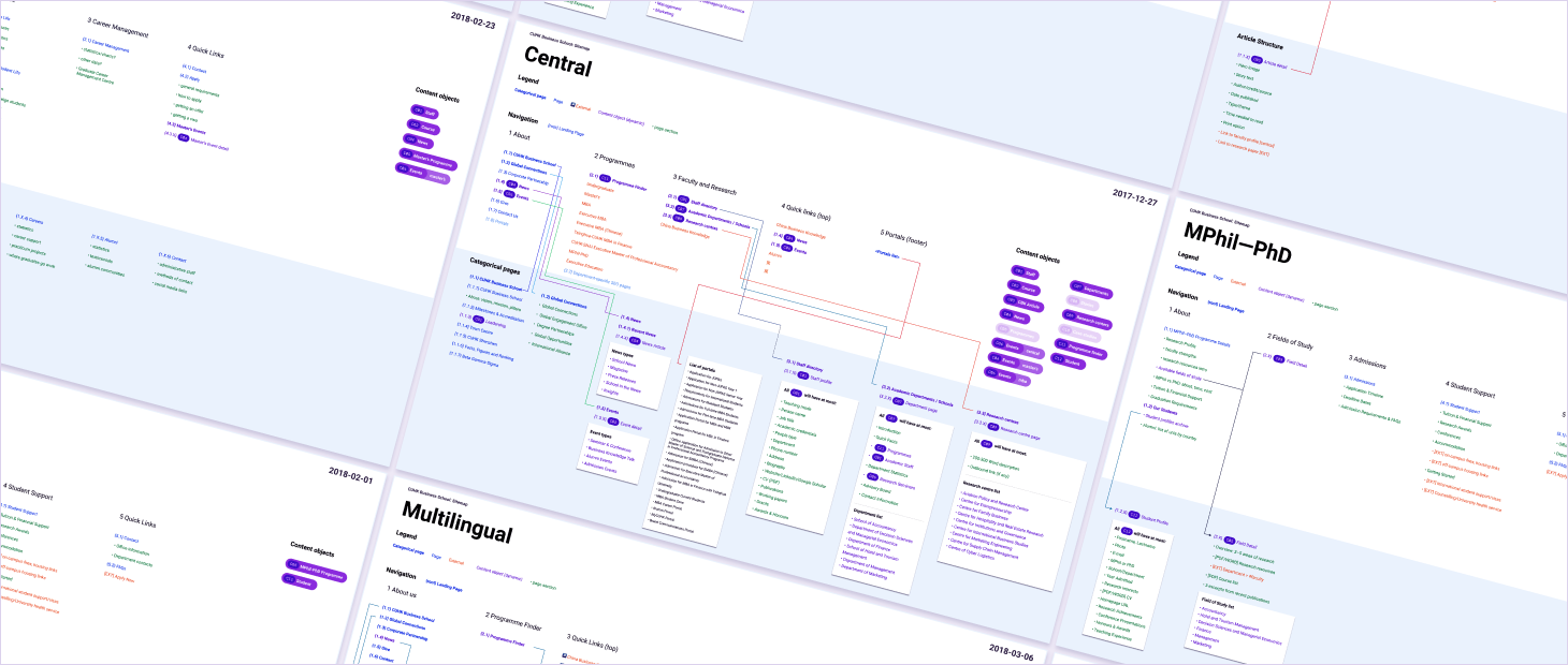
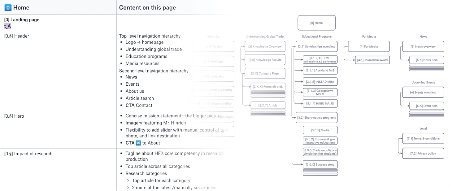
Information architecture
A clear flow of info
With a content-heavy site serving a bevy of stakeholders at different levels, it was vital to establish a crystal clear information structure prior to any work on a design system.
Our process for this massive project was naturally more in-depth than usual. We laid out the structure visually for each constituent site, providing obvious hierarchy within the design system and calling out elements shared across multiple sites.
This style of documentation was very helpful for the design process, with the project team often printing them out in large format and marking them up for reference during our frequent check-ins.
visual design
One design system to rule them all
With the site structure locked-down, it was time to work CUHK’s existing branding into a cohesive design system that could handle any content they threw at it for the foreseeable future.
One particular challenge was in the design of the programme cards. Our proposed design system featured prominent graphics to call attention to these core areas of the site. We iterated extensively with different combinations of colours, textures, and patterns. In the end though, considering the large amount of print collateral in the existing design system, they opted for continued use of the school’s brush stroke pattern.
development
Living style guide
To ensure a long lifecycle for the family of sites, we mapped our design system to a live pattern library for the school to take reference to in the future.
While concurrent development of five sites and a living design system may seem overwhelming, staggered launch dates allowed the central site to serve as a base from which the rest could be developed, and also a testing ground to see the effectiveness of different elements of the design system.
Post-mortem
On-going partnership
Such large and long-running projects inevitably hold challenges. Over the years, as project team members swapped in and out, Grayscale always strove to coalesce their varied opinions and keep the project centred around student needs.
With changes in personnel, a design system can be a powerful tool to keep everyone on the same page—though not without effort! Exceptions can always be made to the rule, but having strong core leadership is absolutely vital.
When internal stakeholders are regularly briefed and aware of possibilities and constraints, a good design system can keep an organisation running for years into the future!
YOUR PROJECT
Let’s hear that concept
Grayscale constantly works together with you to find the best solutions, balancing you and your users’ needs, brand values, budget, and other variables.
Not only can we translate your existing offline identity onto the web, but we can also help you create a brand identity from scratch.
Debate Hong Kong
Branding • Website Design • Website Development
Grayscale developed a simple brand for Debate Hong Kong and helped them launch their first ever website. Colourful patterns and hand-drawn details appeal to the kids taking the programmes, while a clear layout of information ensures the parents can easily find the information they need.
Fair Employment Agency
3D & Custom Illustration • Website Design
Doing good is one of Grayscale’s core values, so we are excited to help FEA, a non-profit hiring agency with ethical practices, to design their website.
Haldanes
Website Design • Website Development
Grayscale’s design of the law firm’s new online presence highlights Haldanes’ hard-earned experience practicing law and the well-deserved reputation with a streamlined user journey.
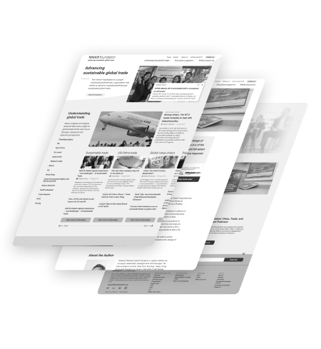
Hinrich Foundation
User Experience (UX) Research • Website Design
Hinrich Foundation
Advancing sustainable global trade
Working with founder and longtime global trade advocate Merle Hinrich to update his foundation’s corporate messaging was a once-in-a-lifetime experience. This in-depth project put Grayscale’s research, design, and collaboration skills to the test in creating a new design language to further their objectives for years into the future.
Client Location
Hong Kong & Asia-Pacific
industry
Philanthropic research, education, & advocacy
Scope of work
User research
UI design
site link
the brief
Addressing the results of a strategic review
Critically unsatisfied stakeholders, outdated website design, and structural changes in the organisation’s offerings: these were just a few of the issues raised in a recent internal audit of the foundation’s brand presence.
The Hinrich Foundation, begun by Merle Hinrich in 2012 after decades of work with sourcing platform Global Sources, is a philanthropic NGO promoting sustainable global trade through policy research, education, and expert insights.
Right from the kick-off meeting, we realised there was a serious mismatch between the team’s in-person dynamism and the way the foundation was being presented online. In addition to standard functional updates, we needed to ensure that this unique personality shone through in the new site.
11internal stakeholderS interviewed
7STUDENTS & Alumni interviewed
5Corporate partners interviewed
3University partners interviewed
USER research
Getting to know the foundation’s reach
Due to the foundation’s unique position in the realm of global trade, the new site needed to appeal to a wide range of visitors, from students to top CEOs and world politicians! That meant lots of user interviews—27, to be exact!
From in-person and phone interviews, we confirmed our suspicion that the primary issue was a discrepancy between the personality of the key members of the foundation and the image the site gives off. Some comments we heard included:
“Merle is very engaging and passionate in person, but this doesn’t show on the site.”
“The site is very neutral—bordering on dry”
Interestingly, many of the interviewees mentioned that the website catered too much to a part of the foundation’s work they were not interested in. Hearing this from one user group could mean that information needs higher emphasis, but from all of them? A classic case of trying to be everything to everyone turning into offering nothing for no one.
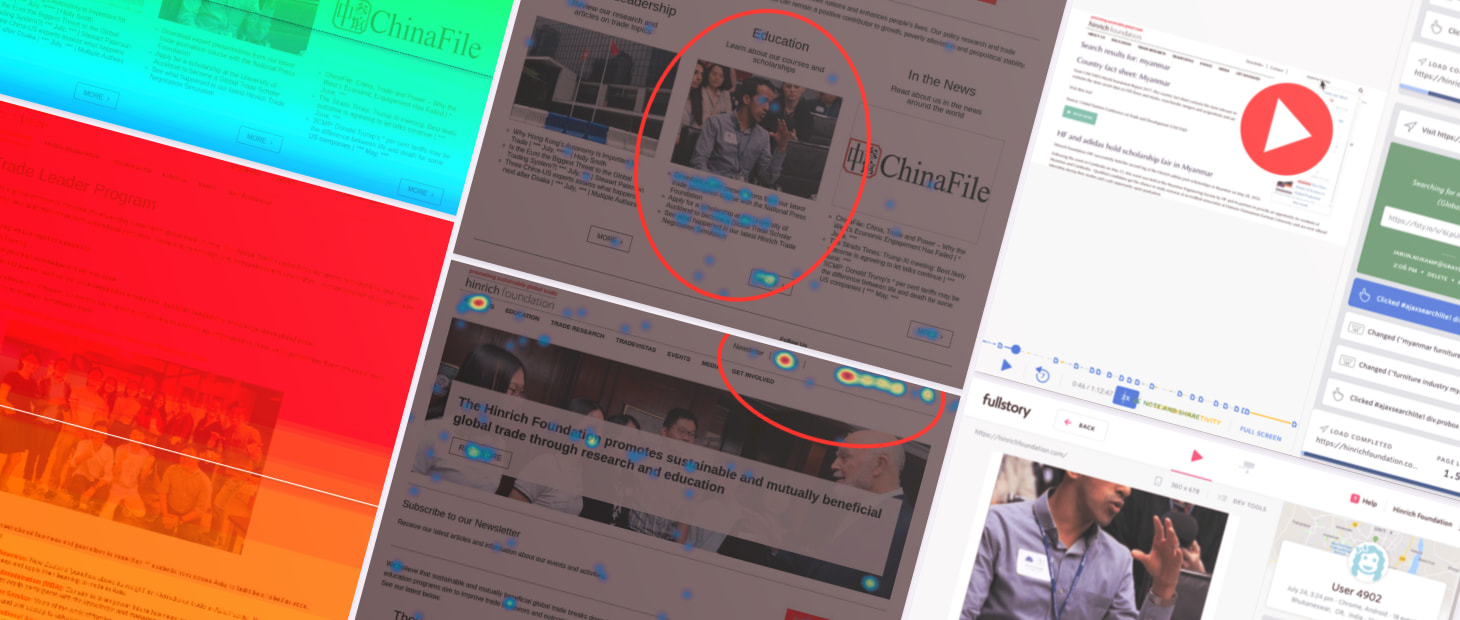
USER research
Quantitative insights
As we were conducting user interviews, our analytics tools were quietly running in the background. From over 400 journeys, we discovered that traffic to what the team considered ‘core’ areas of the site was below expectations and that visitors often couldn’t find what they were looking for.
While engagement with the site was within acceptable levels, a deeper analysis showed that visitors never really found what they’re looking for. User flows didn’t show clear or logical patterns and though 70% visitors clicked into topical pages, 40% dropped off immediately after.
While the search functionality was well-used, many queries indicated a fundamental misunderstanding of the site’s purpose, for example, looking for manufacturers or resellers.
Information architecture
Evolution or revolution?
With different members of the project team each advocating for their own responsibilities within the foundation, agreeing upon an information architecture was the first step towards reaching consensus in the design phase.
Grayscale’s goal with information architecture is always to balance the desires of the stakeholders while ensuring that a clear hierarchy can guide different visitor groups to the content they need. It took much discussion of nomenclature and shuffling of content, but ironing out issues in this phase always lessens the chance of major issues cropping up later.
So, evolution or revolution? Like most projects, the result lands somewhere in the middle.
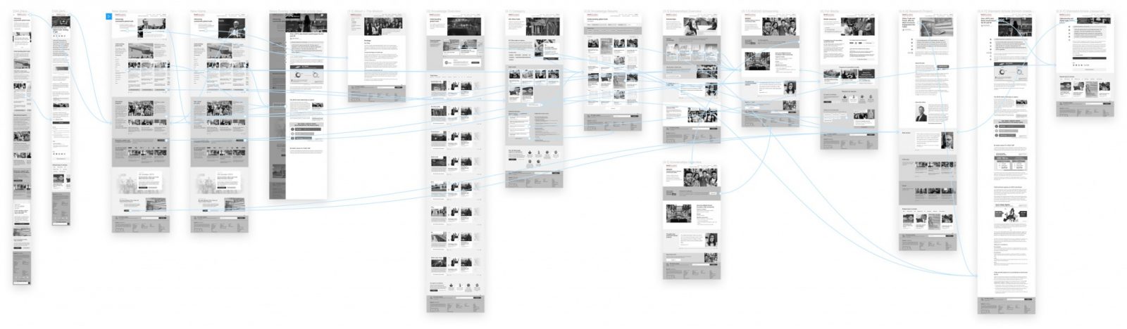
Wireframing
High-fidelity prototyping
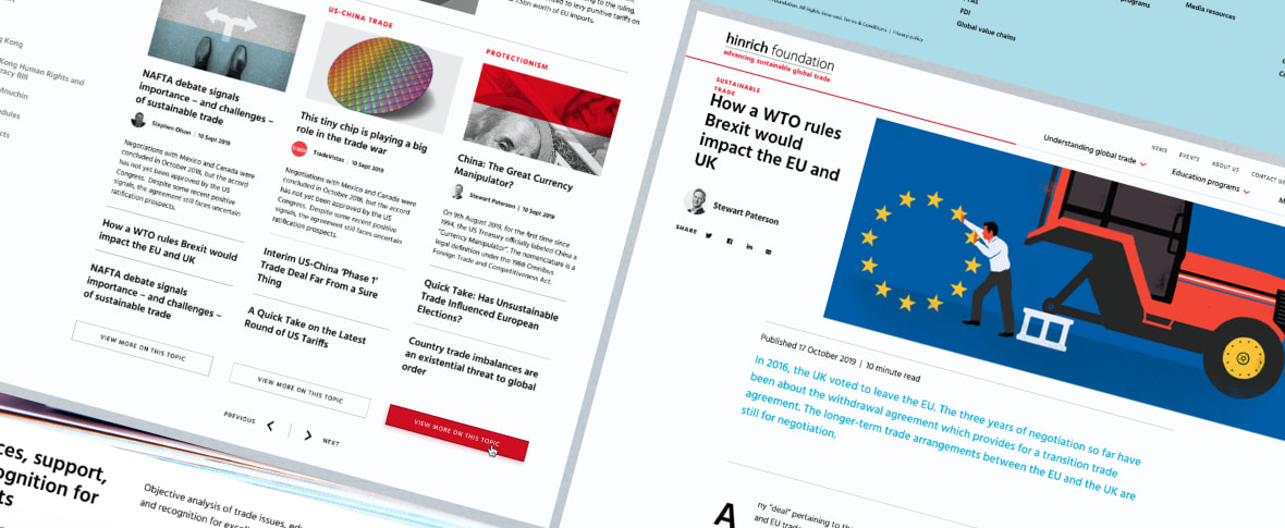
As always, seeing a site visualised for the first time as wireframes prompts many discussions about hierarchy and layout. We debated over how newspaper-like the site should feel and ways to focus on the human element of the foundation.
While the Hinrich Foundation is not primarily a news organisation, the team prides themselves on the research they produce and the media networks inviting them to share their knowledge. To highlight this strength, we proposed a few different layout presets for news articles, allowing a level of customisation and flexibility not usually included in a standard redesign project.
The team also agreed that an overarching design system was needed, which could eventually be applied to sister sites, such as their consumer-oriented news site TradeVistas (which, as of 2021, has been migrated to the main foundation site).
During this stage, we also converted the designs into a clickable prototype for multiple internal testing sessions, while also building up an interaction library to reduce confusion and inform development during the next phase of the project.
Design handover
Further collaboration
Once the wireframes had been agreed to at a high level of fidelity, Stepworks could finally step in to apply the branding they had been working on in parallel for the last few months and together with Tekcent get started on production of the final site.
While there are always a few critical issues that crop up late into development, the intense scrutiny Grayscale and the project team put into every page in the previous stages ensured that the final development phase of the project flowed smoothly.
Sure enough, the site was live and ready to welcome visitors just a few short months later.
YOUR PROJECT
Let’s hear that concept
Don’t know how to start your UX research project? Our team can guide you through these processes and together we’ll come up with a unique solution. Get the results you want.
HKU
Website Design • Website Development
Grayscale worked with the University of Hong Kong in various projects, including the Department of Sociology website and an engaging interactive map for one of the art history course.
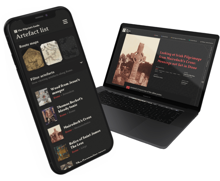
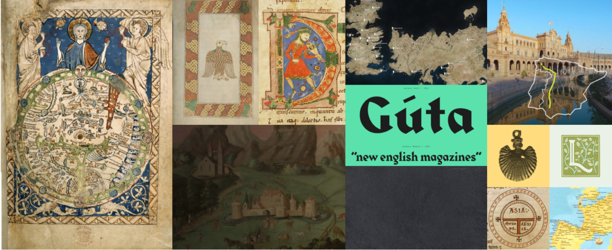
HKU’s The Pilgrim’s Guide
Website Design • Website Development
The University of Hong Kong
Mapping medieval pilgrimage routes and artefacts
An interactive map plotting student research projects and pilgrimage routes forms the core of this scholarly repository. Projects uploaded are both a visually stunning presentation of student work, as well as a valuable resource for years to come.
Client location
Hong Kong
Industry
Higher education
Scope of work
Web design & development
Custom illustration
User experience (UX) research
WebSite Link
The brief
Linking medieval routes to modern study
While the original Pilgrim’s Guide was a twelfth-century guidebook for Spanish pilgrims, our Pilgrim’s Guide strives to provide a similar experience for the modern digital pilgrim.
Since students are used to composing their research into lengthy text reports, Grayscale took up the challenge of not only bringing life to the documents themselves, but also providing a modern understanding of the locations of their artefacts & architecture by providing context in the form of modern & ancient maps of the continent.
The Pilgrim’s Guide will also function as an academic resource for years to come. As the course continues to be taught, more and more students will add their projects, filling out the map and making it ever more valuable!
Brand building
Breathing life into history
Bringing years of art historical experience to the table, Prof. Elisabeth Lastra worked with Grayscale throughout the project to determine the proper feel and visual style.
References ranged from ancient illuminated manuscripts and paintings to more modern cartographic representations of real and fictional places. Early on, though, we realised that we didn’t want to be bound to exact replication of old documents. Therefore, we decided on a dark colour scheme to visually differentiate the project from other, similar endeavours.
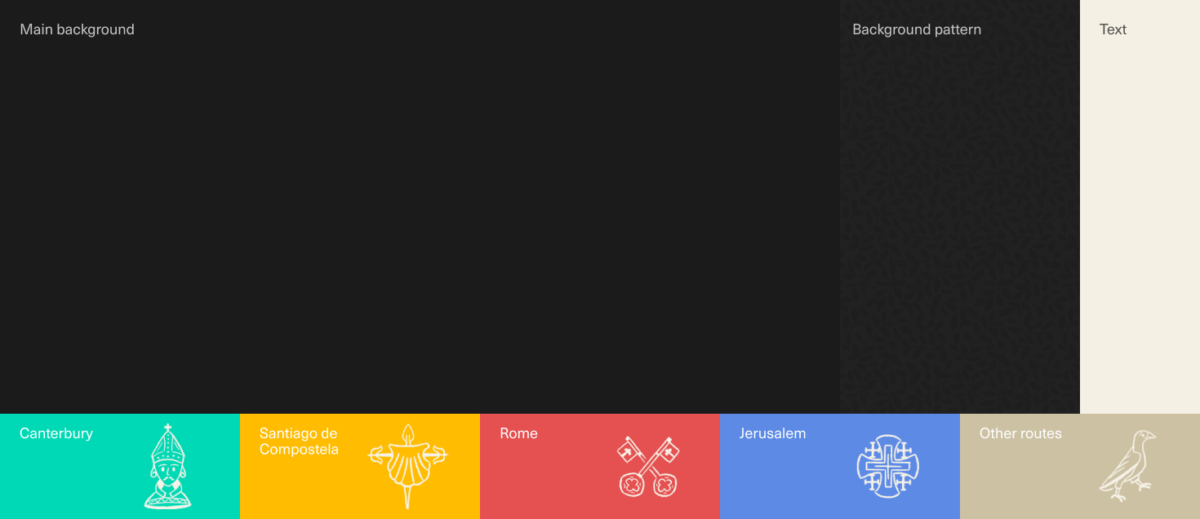
Once the general tone of the site was set, we also had to face the challenge of differentiating individual projects from one another through their design, as well as their content. To do so, we took inspiration from the four pilgrimage routes to derive an accent colour and graphic element that show up throughout the page, such as the five-fold cross and bright blue of Jerusalem’s emblem.
User Experience Research
A real portfolio piece for the students
To ensure we were building a product that would actually cater to the needs of the students, we met with them a few times over the course of the project to share our status and hear out their thoughts and concerns.
Without incurring too much additional development time, we wanted to make sure that students could add various multimedia elements to really make their reports shine—especially elements that can only exist in an online environment. Depending on the artefact, students have embedded videos, zoomable high-resolution photos, and even interactive 3D models!
“I wish to express my sincere appreciation to Grayscale for their professionalism and enthusiasm in presenting our material not only from the form of a website, but a very professional one.”
The Pilgrim’s Guide contributor
Web Development
Unique project constraints
Coding The Pilgrim’s Guide was no simple task. This project differed greatly from most sites we work on, not only in its layout and navigation patterns, but also in the content it needs to cater to, both now and into the future.
Navigating projects through a map interface presented its own special set of challenges. We went through many rounds of iteration to make sure everything was smoothly linked up—selecting a project in the list view zooms to it on the map and hovering over a map pin highlights that same project in the list.
As project pages are still mostly made up of text, the reading experience here is paramount. UX considerations include a reading time indicator, a persistent chapter selector, and footnotes located to the side of the text, so as to not interrupt the reading flow.
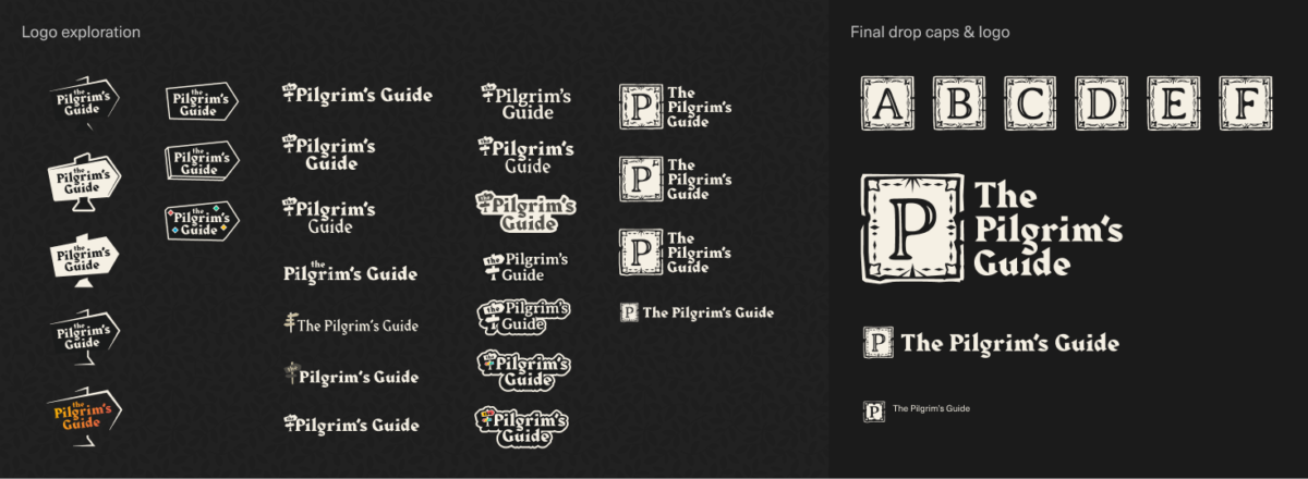
In addition, we needed to consider a few non-standard elements, such a set of custom drop caps and an on-demand faux Greek font to make sure that any Greek text would remain in-style and not fall back to an ugly system standard font or need to download any additional font files.
Post MortEm
Why we love this project
We had a blast working on this project. Not only was designing an art historical resource at one of the top universities of Hong Kong a unique project brief, but working with Prof. Lastra and her students was a breeze— the client really does make the project!
YOUR PROJECT
Let’s hear that concept
Want to start a website project? Our team can guide you through these processes and together we’ll come up with a unique solution.
Get the results you want.
Hongkong Land
Website Design • Website Development
Hongkong Land worked with Grayscale to develop a website that showcases their new event space’s modular capabilities, restaurant, terrace, and accompanying app.
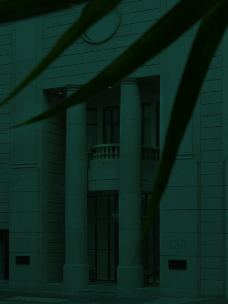
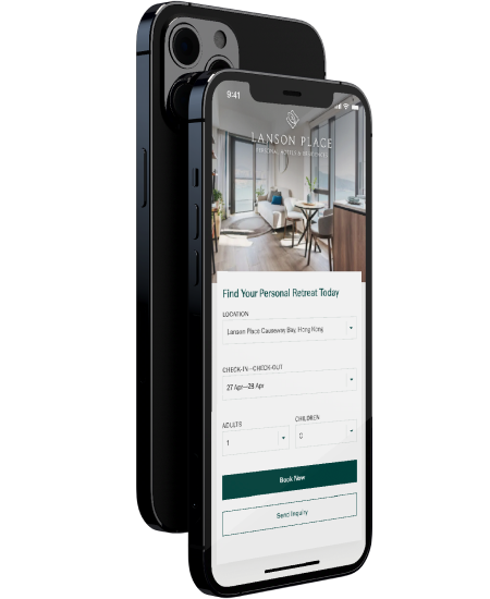
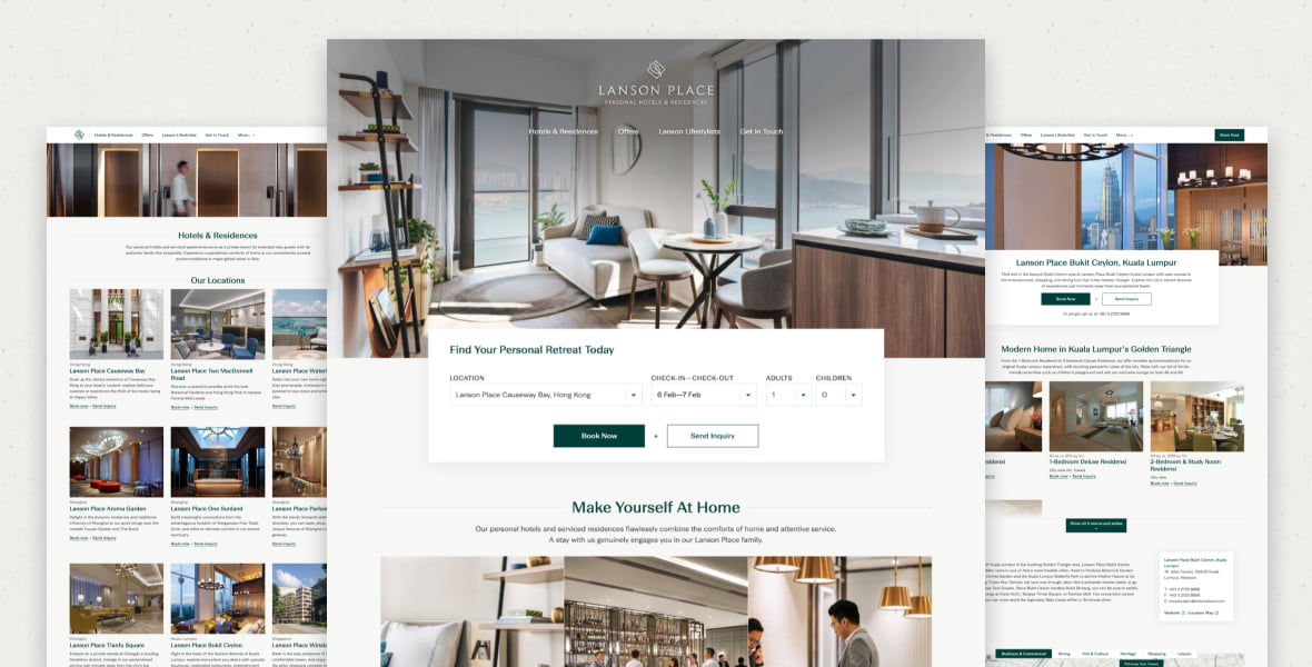
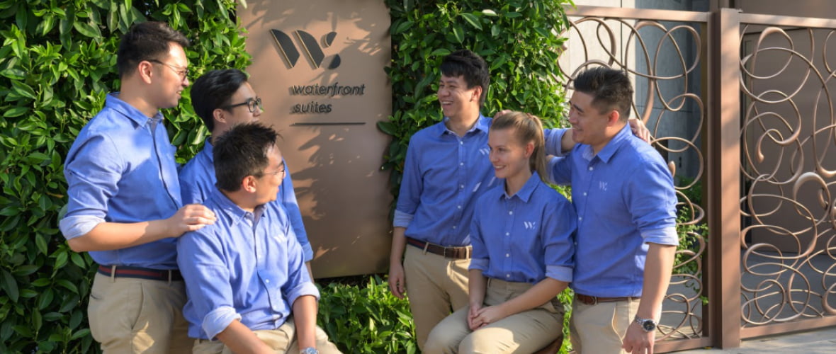
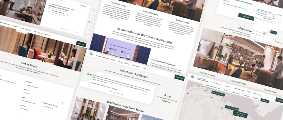
Lanson Place
Website Design • Website Development
Lanson Place
A family of boutique hotels & apartments
Lanson Place is a Hong Kong-based hospitality group expanding their presence across the Asia-Pacific region. With this growing portfolio came the need for an updated and unified online presence.
Client Location
Hong Kong & Asia-Pacific
industry
Hospitality
Scope of work
Web design & development
Design system
site link
the brief
Bringing the family together
2020 might have been a difficult year for the hospitality industry, but Lanson Place is pressing ahead and expanding their presence across the Asia-Pacific region.
Their ambitious plans for their 9 (soon to be 11) locations included a full redesign of each of their sites, as well as the central corporate site. These redesigns were to be based upon a new design system and corporate identity conceived by Grayscale and Eight Partnership and implemented over a period of two years.
The planned design system would improve the brand’s personality and identity, with increased guest engagement and bookings through the site, and with staff actively using the site as a reference and promotional tool.
12total websites
7cities across asia-Pacific
3Years of co-operation
User research
Getting to know guests & hosts
The early stages of this project were focused on information gathering, both in person at Lanson Place’s three Hong Kong locations, and over-the-phone with staff and guests across Asia-Pacific.
After touring facilities, seeing the rooms and talking with staff, we had a proper feel for the level of service that would need to be portrayed on the new site.
We combined these first-hand views with Lanson’s freshly-developed corporate identity to start constructing the base of a web design with the perfect blend of brand expression and guest focus.
Accessibility
Translating brand to web
Working from a base corporate identity, Grayscale applied our expertise in UX and accessibility to ensure their brand guidelines were properly implemented on the web.
For example, we always ensure that colour contrast is high enough between light text and the background, so as not to put a strain on those with less-than-perfect vision.
For more complex parts of the site, such as the booking form, we ensured that the inputs are accessible by keyboard, for those navigating the site without a mouse.
Visual Design
Iconic rooms
In the course of developing the new design system, Grayscale proposed an expanded icon set to call attention to their rooms’ amenities.
We began by performing an audit of the amenities for rooms across all nine locations. From this, we determined that certain ones could be combined under a single design, which, after a few rounds of iteration, gave Lanson Place a final set of around 30 icons that they can use across all properties, current and future.
Development
A centrally- structured family
A project as complex as this has many potential pitfalls. Luckily, Lanson Place HQ’s strong leadership guided the property sites and helped to protect and grow the design system.
Built with WordPress Multisite, the family of sites can be easily interlinked, for example aggregating offers, reviews, and careers on the corporate site, and pushing press releases out to property sites.
In order to smoothly transition to this full functionality, we created temporary pages holding the most important information for each of the properties, meant to live alongside the old designs until each full property site was ready to launch.
SEcondary stakeholders
Welcoming new hosts
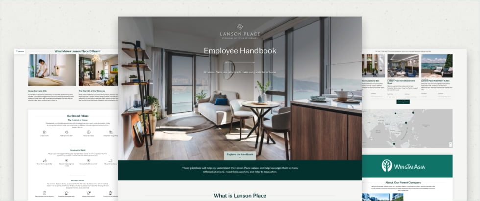
As Lanson Place staff were also a key user group for this project, we developed a password-protected single-page employee handbook for their reference.
Though not a usual request for even large web projects, this interesting add-on functions as an expanded about page to guide new hires and serve as a quick brand reference for existing staff.
Ante-mortem
Continuous improvement
With the final redesigned property site scheduled to launch in 2022, this long-running project has required us to constantly adapt and tweak our design system to fit the steady stream of incoming content.
Staggering the launch dates of the property sites over the course of two years let Lanson Place roll out their new corporate identity as quickly as possible, while also allowing for progressive insight and accommodating ongoing input from property managers.
YOUR PROJECT
Let’s hear that concept
Have a suite of websites to build and don’t know how to start?
Our team can guide you through these processes and together we’ll come up with a unique solution. Get the results you want.
LingU
Website Design • Website Development
Team Grayscale worked with both the teaching staff and the admins of Lingnan University Department of Translation and Department of Cultural Studies to create a scholarly yet branded layout.
The website’s easy-to-update CMS can help improve the overall operational efficiency, too.
LYNK
User Experience (UX) Research
LYNK updated their brand promise and visual identity. Grayscale was tasked to realign the UX of their website so it is ready for their many new innovative products and services.
Mundial
Website Design
Mundial is shifting from an established B2B wholesaler to a B2C platform. With a global presence and massive product line-up, Grayscale helped the team create an e-commerce solution that is pleasant to use and efficient to manage.
Nelson Chen Architects
Branding • Website Design • Website Development
Nelson Chen Architects is a firm led by the former Director of the School of Architecture, CUHK. Grayscale was asked to create a website that matches their meticulous design standard and ambition.
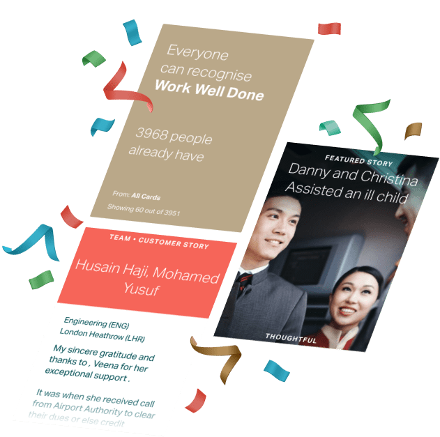
oneWorld
Internal Portal • Website Design • Website Development
Grayscale designed and developed a talent portal that facilitates internal recruitment within the oneWorld alliance. Managers can easily post short term projects and find interested staff members across airlines.
Pan Asian
Website Design • Website Development
Grayscale was tasked by Pan Asian—one of Hong Kong’s leading mortage advisory company—to modernise and develop their dated multilingual websites.
Pedder Group
Website Design • Website Development
Grayscale assisted the Pedder Group design and develop a contemporary website with vibrant personality that targets fashionistas and upmarket shoppers in Singapore, boosting the location’s traffic at its launch.
PolyU
Website Design • Website Development
Grayscale helped PolyU with an ambitious project by merging AR and local knowledge into an impressive learning experience.
Press Start Hong Kong
3D & Custom Illustration • Website Design • Website Development
Press Start Academy is an education start-up that approaches learning through play and games. Grayscale helped design and construct a game interface-inspired website and facilitate the enrollment of their exclusive holiday and after-school courses.
PTS Managed Services
Website Design • Website Development
With a team striving for ever greater delivery efficiency, security, and process management, PTS offers top-quality IT services. Grayscale worked with PTS to re-design and develop their website with a refreshed look and streamlined user journey.
Quantifeed
Branding • Website Design • Website Development
Quantifeed is one of Hong Kong’s most successful FinTech start-ups. Grayscale worked on their branding and online presence, giving them a trust-worthy vibe.
Sealy
Website Design • Website Development
Grayscale helped Sealy market their range of luxurious mattresses and direct customers to their flagship stores across Hong Kong with a new website.
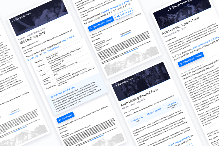
Silverhorn Investment Advisors
3D & Custom Illustration • Branding • Photography • Website Design • Website Development
Silverhorn Investment Advisors
Precision Swiss investing, at home in Hong Kong
As Silverhorn’s digital partner, Grayscale not only has helped with the development of their corporate and product websites over the years, but also with general branding and a range of printed collateral and digital presentation materials.
Client location
Hong Kong & Zürich
Industry
Investment
Fintech
Scope of work
Web design & development
Branding
3D & custom illustration
Document design
WebSite Link
The brief
From redesign to long-term relationship
We first got to know Silverhorn in late 2018, working to give their online presence a long-overdue makeover. Since then, we’ve continued to work closely with the team on internal and external projects of all sizes.
Getting to know their diverse team of locals and transplants from around the world, we quickly realised that this is no everyday fintech start-up. They’ve got serious investment abilities and real client trust built up over their past decade of operations, all of which needed to be reflected in a new online presence: in-depth enough to show investors they know their stuff, while light enough to keep clients engaged and educated.
Grayscale built two websites for us and revamped our offline marketing materials. Where they excel is in how they engage with you—getting to understand your brand and unique needs, then going the extra mile to execute on their promises.
Carson Au, Marketing Associate

50documents & presentations
2websites
40photographs shot
Branding
Styling the Silverhorn
To help the company stand out in a sea of fintech companies and much larger investment corporations, we decided early to go all-in on a dark theme with pops of bright blue in the graphics and iconography.
Though Silverhorn’s existing brand assets were rather sparse, we knew from the start that a unique series of aerial photos of the Swiss alps, taken by early 20th century balloonist Edouard Spelterini, would continue to feature prominently.
Applying the new style to Spelterini’s stunning photography of the Silberhorn peak, overlaid with a Silverhorn Blue line cutting through the fog of the investment landscape, results in a unique centrepiece for the main pages of the site.
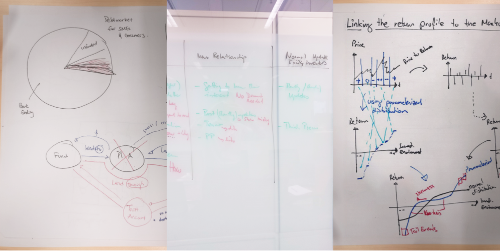
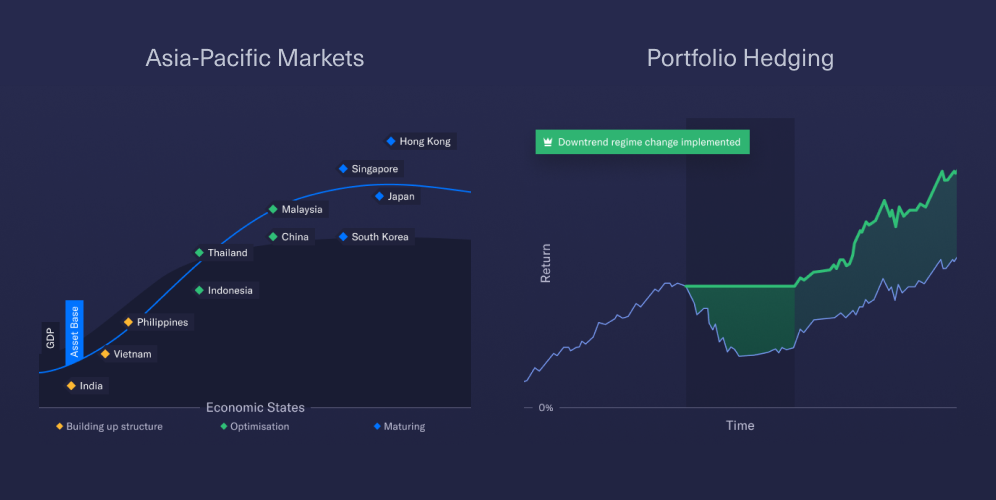

Data visualisation
Simplifying complex concepts
Presenting complex financial topics and processes to discerning investors and clients is no easy task.
Many a napkin sketch and whiteboard scribble were exchanged with the Silverhorn team as we worked our way through process-oriented graphics and conceptual animations.
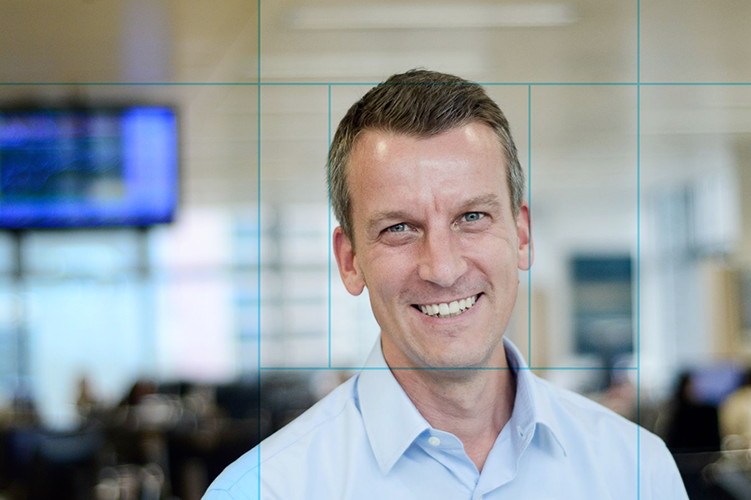
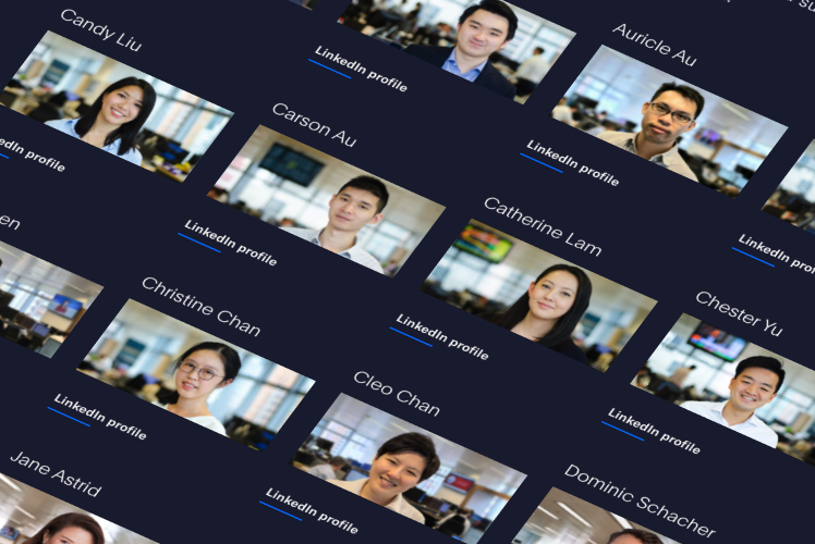
Photography
Best face forward
Behind every investment algorithm is a team of hard-workers, and we wanted to give every one of them their spot to shine. Over the course of a few days, we met with and shot portraits for all of Silverhorn’s team members.
Staff come and go, though, and as much as we love Silverhorn, we couldn’t be lugging our photography equipment over every time they got a new hire. To help the team take quality photos of new staff, we developed a set of guidelines covering composition, lighting, camera settings, and post-production.
Check out their company page and see for yourself if you can tell which ones we took and which ones they did!
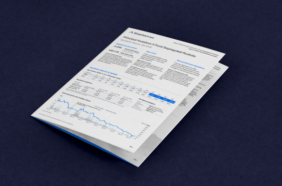
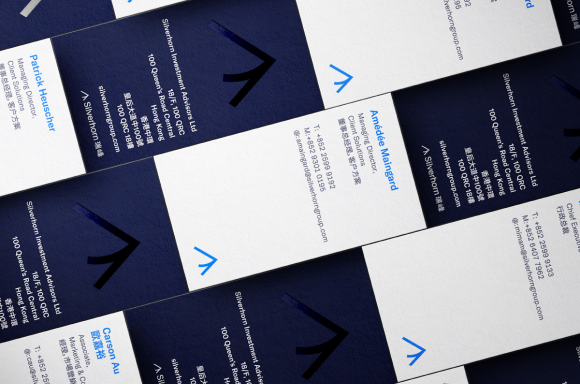
Print Design
Bringing design into the real world
With the digital style well-established, our next logical step was to update the rest of Silverhorn’s printed collateral, including client reports and business cards.
Existing documentation spanned a wide range of content types, from text-heavy analyses to primarily table- and graph-based reports. For environmental and legibility reasons, we opted against using a dark theme for printed collateral. Instead, we adapted our design system for these documents, keeping the Silverhorn blue as a constant, while adding more shades and a range of secondary colours to use in varied data visualisation situations.


Design system
Cross-content consistency
When an investment opportunity into ethical lending companies matured enough to merit its own child site, our design system was again called back into service.
With some adaptation to the colour scheme and the creation of a few more conceptual animations to visualise Silverhorn’s involvement in this new lending scheme, the site was soon ready to launch.
Ante-Motrem
On-going partnership
Our ongoing partnership with Silverhorn has led to many interesting projects, including e-mail marketing campaigns, an one-off logo production for an internal project, and even helping their internal marketing team master Figma to create their own graphics and charts!
YOUR PROJECT
Let’s hear that concept
Grayscale constantly works together with you to find the best solutions, balancing you and your customers’ needs, your brand values, and other variables.
Not only can we translate your existing offline identity onto the web, but we can also help you create a brand identity from scratch.
Exceptionally creative and caring professionals. The level of care and passion they put in their work is truly inspiring. Keep up the good work!
Carson Au, Marketing Associate
Society for Hong Kong Studies
3D & Custom Illustration • Website Design • Website Development
As a young and independent academic association focusing on Hong Kong Studies, SHKS needed help to better showcase their discipline and professionalism, and show the field’s uniqueness and value through perspectives that connect Hong Kong to the outside world.
Sprout
3D & Custom Illustration • Website Design • Website Development
Grayscale worked with Sprout team to redesign the website to generate quality leads by answering potential customers’ initial concerns and trigger them to get in touch.
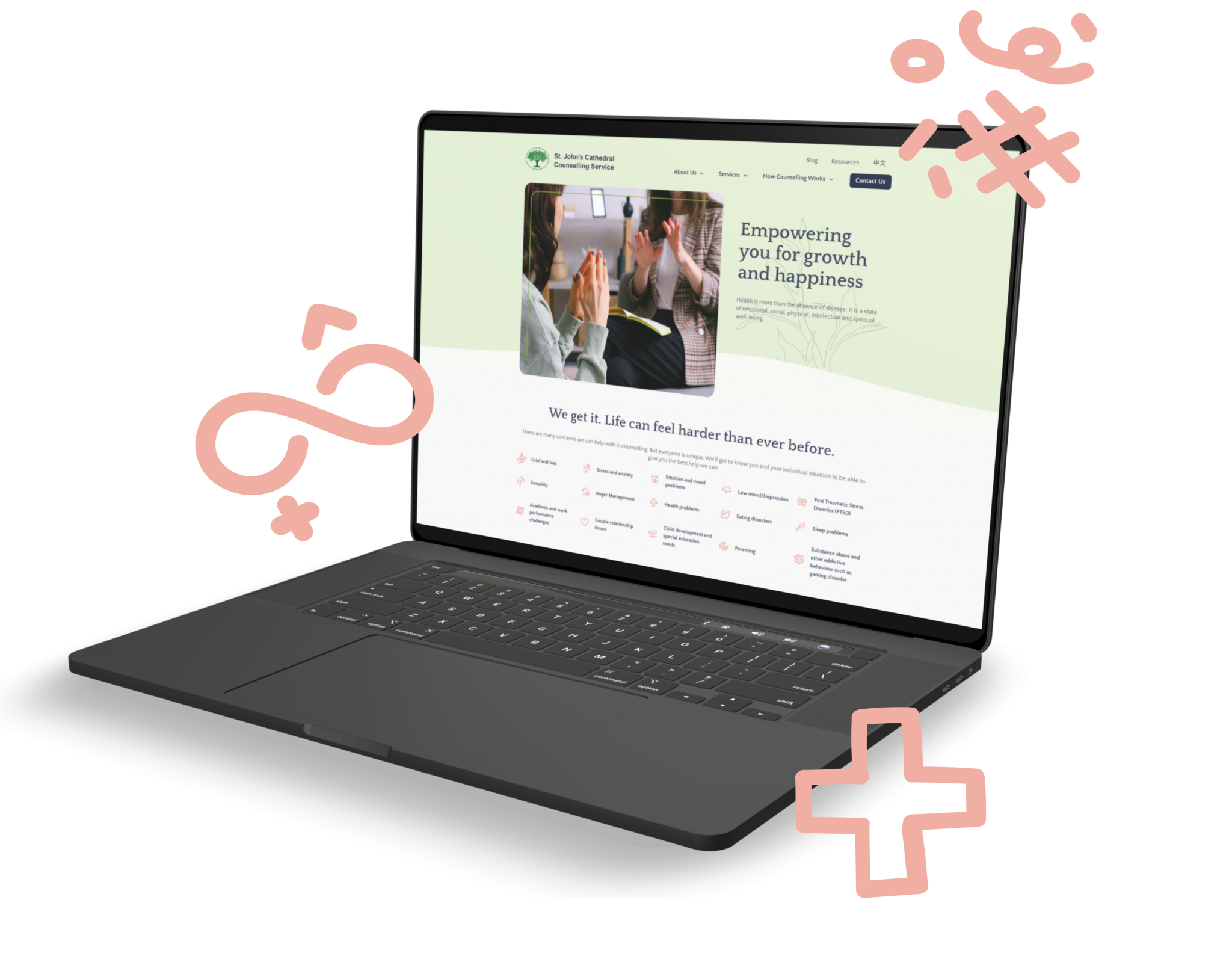
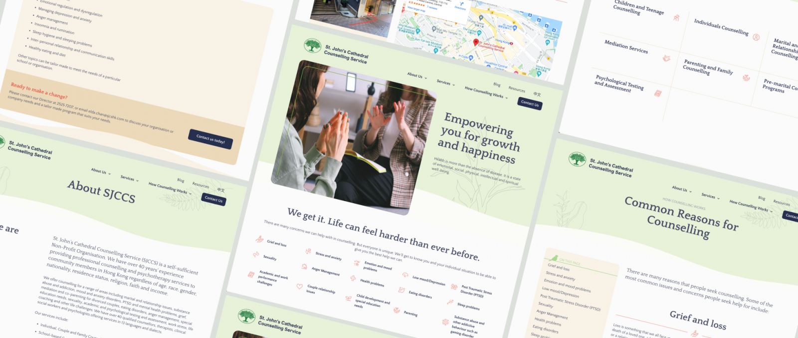
St John’s Cathedral Counselling Service
3D & Custom Illustration • Website Design • Website Development
St John’s Cathedral Counselling Service
Empowering people with growth and happiness
Team Grayscale helped the professional counselling and psychotherapy team to do a complete overhaul of their online presence, from analysing and rebuilding the user flow to designing a clean, modern, and airy front-end supported by a user-friendly CMS to improve overall operational efficiency.
Client Location
Hong Kong
industry
Non-Profit Organisation
Counselling
Scope of work
Web design & development
Custom illustration
site link
the brief
Taking the first step towards counselling
Providing professional counselling and psychotherapy to community members in Hong Kong for over 40 years, St John’s Cathedral Counselling Service was looking for more than just a new website to exhibit their qualified, multilingual professionals.
To better serve the community, SJCCS team wanted to make full use of the new website to ensure a positive experience for all potential clients, and encourage them to take the first step towards knowing more about their counselling services.
design process
Here to help
From the kick-off workshop, we realised that there were quite a few challenges to start with: extremely content-heavy, a messy hierarchy, and outdated website design. While the search engine result and SEO performance were within acceptable levels, updating the site and comprehending their range of services as a visitor was a nightmare.
With the extent of their branding being a simple tree logo, Grayscale led the project with a revised information architecture to balance what content they wanted to write and what content visitors wanted to see. We applied our expertise in UX and user analysis to ensure that the new website gives a clear hierarchy and guides different visitor groups to the content they need. To facilitate a smooth user journey, we proposed adding the level of “knowing your symptoms”, instead of a non-stop push for the Call Us Now button.
In the course of designing the new layout, Grayscale also proposed to expand the text-heavy content with a set of coral-coloured, customised icons. With such visual aids, we expect visitors to feel less stressed when reviewing common issues and concerns for counselling, while also giving SJCCS the assets that they can use across all marketing collateral.
Post-mortem
Why we love this project
This was one of those relatively simple, but high-impact projects that Grayscale loves working on.
Mental health has always been a seriously under-emphasised topic in Hong Kong, and now more than ever, society needs affordable and accessible (and multilingual!) mental health support. Not only are we proud of the final product and the services SJCCS provides, but our great working relationship with the team was also crucial to the project’s success.
Despite their heavy workload, their invaluable feedback helped shape the site’s look and feel, resulting in an atmosphere as calming and therapeutic as their office and providing a welcome respite from our chaotic everyday world.
Your project
Let’s hear that concept
Grayscale constantly works together with you to find the best solutions.
Not only can we translate your existing offline identity onto the web, but we can also help you create a brand identity from scratch.
Sun Hung Kai Financial
Website Design • Website Development
Grayscale worked with SHKF on redesigning its intranet to help boost work efficiency. We found the user’s pain points through elaborate user-testing, then resolved them with intuitive and user-friendly interfaces.
Superl Group
Photography • Website Design • Website Development
Hong Kong-based manufacturer Superl has an extremely diverse product range and sought Grayscale’s help to bring their many products together under a single group umbrella.
Swire Resources
Website Design • Website Development
Swire Resources has connected with numerous brands over the years. Grayscale was tasked to design and develop their first website, highlighting their strength in brand management.
Tekcent
Branding • Website Design
Grayscale worked closely with Tekcent to not only give their website a fresh visual feel, but also to improve the clarity of information flow and overall site navigation.
The Edge Learning Centre
Website Design • Website Development
Being one of the pioneering learning centres in Hong Kong, The Edge has been continuously enhancing their online presence and Grayscale has been facilitating the feature upgrades on their website.
VenueHub
3D & Custom Illustration • User Experience (UX) Research • Website Design
Hong Kong’s biggest venue and event services platform worked with Grayscale to solidify their position at the top of the market with a unique design, appealing to both event bookers and venue owners.
WeLend
Website Design • Website Development
WeLend was rebranding and commissioned Grayscale to work on revamping their website UX and design. In the end, we developed a new website that quadrupled the conversion rate.
Zung Fu (Mercedes Hong Kong)
User Experience (UX) Research • Website Design
With the goal of providing a seamless digital experience to Mercedes-Benz owners in Hong Kong, Grayscale did in-depth, on-site user testing to inform our design of the new service scheduling portal.