CUHK Business School
Looking forward to a new business school experience
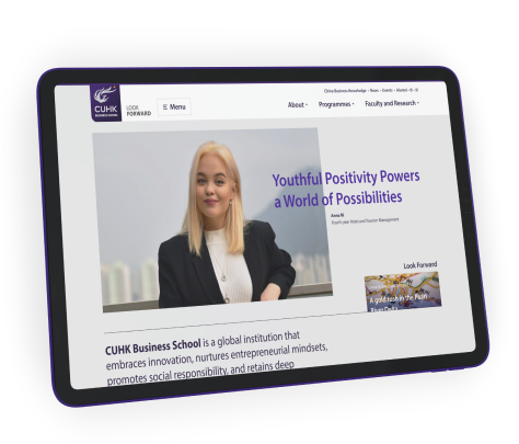
Following a radical rebrand earlier in the decade, this growing faculty needed to apply that branding in a unified way across its varied programme sites, all while balancing internal communication objectives with inspiring success stories.

Client Location
Hong Kong
industry
Tertiary education
Scope of work
Web design & development
User research
site link
the brief
Planning a unified platform
With an ever-growing amount of programmes and content to manage, the team was looking for not only a new suite of websites, but a comprehensive design system to guide development even further into the future.
A recent brand analysis had informed the school that key communications objectives were not being picked up by their target audiences, and that substantial opportunities for organic growth were being missed.
In addition, Grayscale identified that their current web design, while closely aligned with their print collateral, was showing signs of age and not optimised for mobile. The last point being a serious cause for concern since 25% of all traffic was coming from such sources—and showing an alarmingly high bounce rate!

research
Focus group feedback
To ensure the site truly meets the needs of all visitors, we conducted focus group meetings and one-on-one interviews with both incoming and current students from undergraduate, masters, and MBA programmes.
From these meetings, we found that students were unsurprisingly hyper-focused on the application process, a rather byzantine task on the existing site. While a redesign of that was not within the scope of the project, we made sure our design system provided clear pathways to get there.
The interviews also shed light on some secondary stakeholders, specifically parents of undergraduates, who we discovered were often more comfortable reading material in Chinese. Since a full multilingual site was out of scope, we instead planned out a condensed Chinese site focused on programme details and the application process—the most vital information for parents.
Information architecture
A clear flow of info
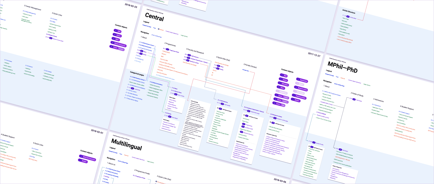
With a content-heavy site serving a bevy of stakeholders at different levels, it was vital to establish a crystal clear information structure prior to any work on a design system.
Our process for this massive project was naturally more in-depth than usual. We laid out the structure visually for each constituent site, providing obvious hierarchy within the design system and calling out elements shared across multiple sites.
This style of documentation was very helpful for the design process, with the project team often printing them out in large format and marking them up for reference during our frequent check-ins.
visual design
One design system to rule them all
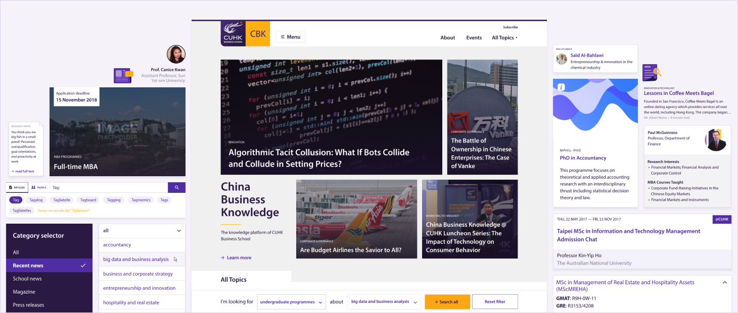
With the site structure locked-down, it was time to work CUHK’s existing branding into a cohesive design system that could handle any content they threw at it for the foreseeable future.
One particular challenge was in the design of the programme cards. Our proposed design system featured prominent graphics to call attention to these core areas of the site. We iterated extensively with different combinations of colours, textures, and patterns. In the end though, considering the large amount of print collateral in the existing design system, they opted for continued use of the school’s brush stroke pattern.
development
Living style guide
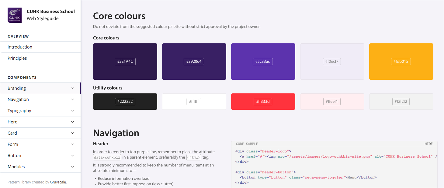
To ensure a long lifecycle for the family of sites, we mapped our design system to a live pattern library for the school to take reference to in the future.
While concurrent development of five sites and a living design system may seem overwhelming, staggered launch dates allowed the central site to serve as a base from which the rest could be developed, and also a testing ground to see the effectiveness of different elements of the design system.
Post-mortem
On-going partnership
Such large and long-running projects inevitably hold challenges. Over the years, as project team members swapped in and out, Grayscale always strove to coalesce their varied opinions and keep the project centred around student needs.
With changes in personnel, a design system can be a powerful tool to keep everyone on the same page—though not without effort! Exceptions can always be made to the rule, but having strong core leadership is absolutely vital.
When internal stakeholders are regularly briefed and aware of possibilities and constraints, a good design system can keep an organisation running for years into the future!
YOUR PROJECT
Let’s hear that concept
Grayscale constantly works together with you to find the best solutions, balancing you and your users’ needs, brand values, budget, and other variables.
Not only can we translate your existing offline identity onto the web, but we can also help you create a brand identity from scratch.
