Hinrich Foundation
Advancing sustainable global trade
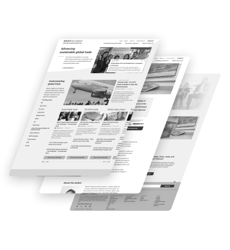
Working with founder and longtime global trade advocate Merle Hinrich to update his foundation’s corporate messaging was a once-in-a-lifetime experience. This in-depth project put Grayscale’s research, design, and collaboration skills to the test in creating a new design language to further their objectives for years into the future.

Client Location
Hong Kong & Asia-Pacific
industry
Philanthropic research, education, & advocacy
Scope of work
User research
UI design
site link
the brief
Addressing the results of a strategic review
Critically unsatisfied stakeholders, outdated website design, and structural changes in the organisation’s offerings: these were just a few of the issues raised in a recent internal audit of the foundation’s brand presence.
The Hinrich Foundation, begun by Merle Hinrich in 2012 after decades of work with sourcing platform Global Sources, is a philanthropic NGO promoting sustainable global trade through policy research, education, and expert insights.
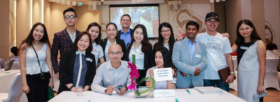
Right from the kick-off meeting, we realised there was a serious mismatch between the team’s in-person dynamism and the way the foundation was being presented online. In addition to standard functional updates, we needed to ensure that this unique personality shone through in the new site.
11
internal stakeholderS interviewed
7
STUDENTS & Alumni interviewed
5
Corporate partners interviewed
3
University partners interviewed
USER research
Getting to know the foundation’s reach
Due to the foundation’s unique position in the realm of global trade, the new site needed to appeal to a wide range of visitors, from students to top CEOs and world politicians! That meant lots of user interviews—27, to be exact!
From in-person and phone interviews, we confirmed our suspicion that the primary issue was a discrepancy between the personality of the key members of the foundation and the image the site gives off. Some comments we heard included:
“Merle is very engaging and passionate in person, but this doesn’t show on the site.”
“The site is very neutral—bordering on dry”
Interestingly, many of the interviewees mentioned that the website catered too much to a part of the foundation’s work they were not interested in. Hearing this from one user group could mean that information needs higher emphasis, but from all of them? A classic case of trying to be everything to everyone turning into offering nothing for no one.
USER research
Quantitative insights
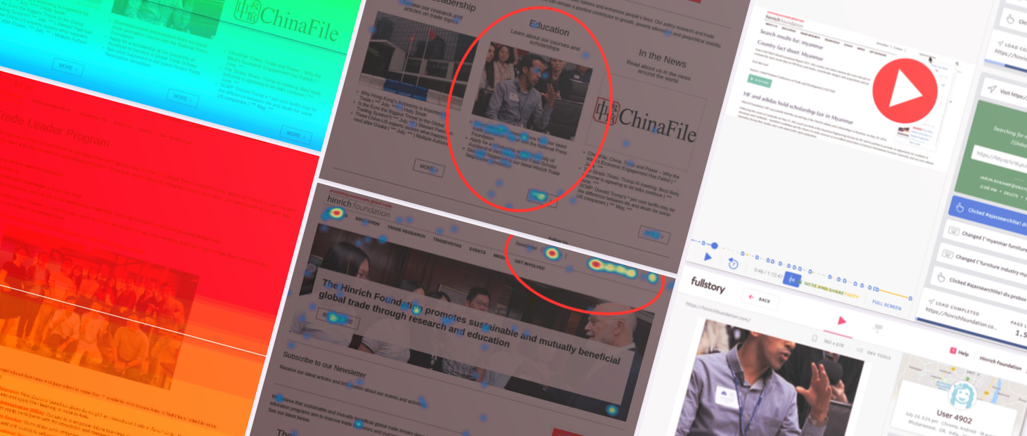
As we were conducting user interviews, our analytics tools were quietly running in the background. From over 400 journeys, we discovered that traffic to what the team considered ‘core’ areas of the site was below expectations and that visitors often couldn’t find what they were looking for.
While engagement with the site was within acceptable levels, a deeper analysis showed that visitors never really found what they’re looking for. User flows didn’t show clear or logical patterns and though 70% visitors clicked into topical pages, 40% dropped off immediately after.
While the search functionality was well-used, many queries indicated a fundamental misunderstanding of the site’s purpose, for example, looking for manufacturers or resellers.
Information architecture
Evolution or revolution?
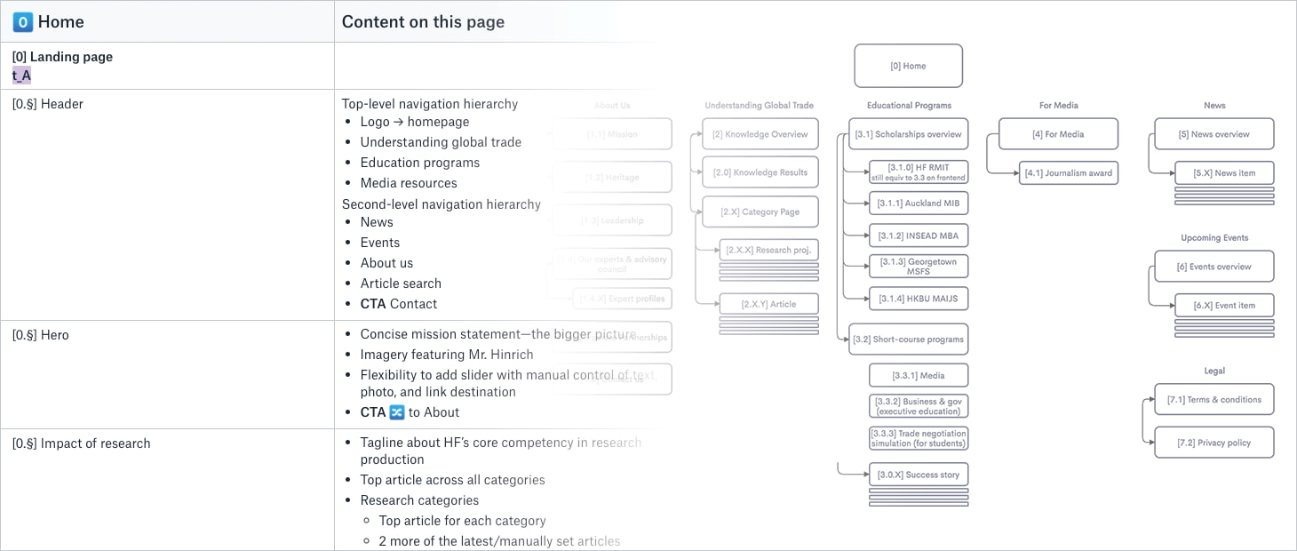
With different members of the project team each advocating for their own responsibilities within the foundation, agreeing upon an information architecture was the first step towards reaching consensus in the design phase.
Grayscale’s goal with information architecture is always to balance the desires of the stakeholders while ensuring that a clear hierarchy can guide different visitor groups to the content they need. It took much discussion of nomenclature and shuffling of content, but ironing out issues in this phase always lessens the chance of major issues cropping up later.
So, evolution or revolution? Like most projects, the result lands somewhere in the middle.

Wireframing
High-fidelity prototyping
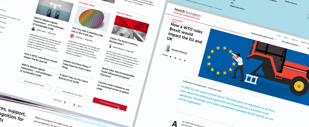
As always, seeing a site visualised for the first time as wireframes prompts many discussions about hierarchy and layout. We debated over how newspaper-like the site should feel and ways to focus on the human element of the foundation.
While the Hinrich Foundation is not primarily a news organisation, the team prides themselves on the research they produce and the media networks inviting them to share their knowledge. To highlight this strength, we proposed a few different layout presets for news articles, allowing a level of customisation and flexibility not usually included in a standard redesign project.
The team also agreed that an overarching design system was needed, which could eventually be applied to sister sites, such as their consumer-oriented news site TradeVistas (which, as of 2021, has been migrated to the main foundation site).
During this stage, we also converted the designs into a clickable prototype for multiple internal testing sessions, while also building up an interaction library to reduce confusion and inform development during the next phase of the project.
Design handover
Further collaboration
Once the wireframes had been agreed to at a high level of fidelity, Stepworks could finally step in to apply the branding they had been working on in parallel for the last few months and together with Tekcent get started on production of the final site.
While there are always a few critical issues that crop up late into development, the intense scrutiny Grayscale and the project team put into every page in the previous stages ensured that the final development phase of the project flowed smoothly.
Sure enough, the site was live and ready to welcome visitors just a few short months later.
YOUR PROJECT
Let’s hear that concept
Don’t know how to start your UX research project? Our team can guide you through these processes and together we’ll come up with a unique solution. Get the results you want.
