St John’s Cathedral Counselling Service
Empowering people with growth and happiness
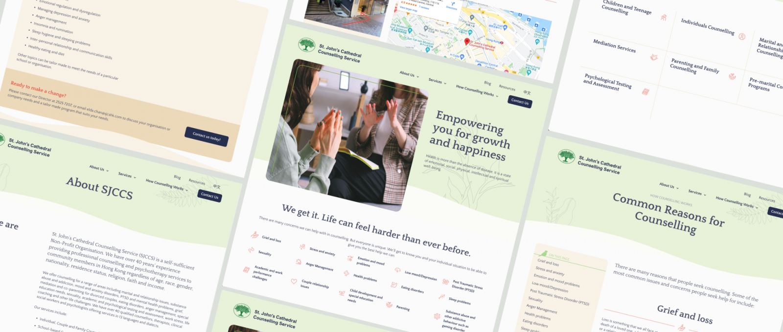
Team Grayscale helped the professional counselling and psychotherapy team to do a complete overhaul of their online presence, from analysing and rebuilding the user flow to designing a clean, modern, and airy front-end supported by a user-friendly CMS to improve overall operational efficiency.


Client Location
Hong Kong
industry
Non-Profit Organisation
Counselling
Scope of work
Web design & development
Custom illustration
site link
the brief
Taking the first step towards counselling
Providing professional counselling and psychotherapy to community members in Hong Kong for over 40 years, St John’s Cathedral Counselling Service was looking for more than just a new website to exhibit their qualified, multilingual professionals.
To better serve the community, SJCCS team wanted to make full use of the new website to ensure a positive experience for all potential clients, and encourage them to take the first step towards knowing more about their counselling services.
design process
Here to help
From the kick-off workshop, we realised that there were quite a few challenges to start with: extremely content-heavy, a messy hierarchy, and outdated website design. While the search engine result and SEO performance were within acceptable levels, updating the site and comprehending their range of services as a visitor was a nightmare.
With the extent of their branding being a simple tree logo, Grayscale led the project with a revised information architecture to balance what content they wanted to write and what content visitors wanted to see. We applied our expertise in UX and user analysis to ensure that the new website gives a clear hierarchy and guides different visitor groups to the content they need. To facilitate a smooth user journey, we proposed adding the level of “knowing your symptoms”, instead of a non-stop push for the Call Us Now button.
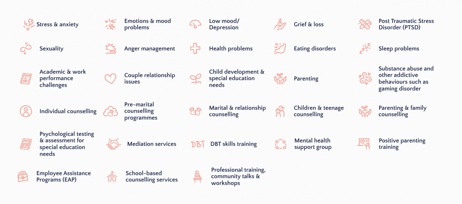
In the course of designing the new layout, Grayscale also proposed to expand the text-heavy content with a set of coral-coloured, customised icons. With such visual aids, we expect visitors to feel less stressed when reviewing common issues and concerns for counselling, while also giving SJCCS the assets that they can use across all marketing collateral.

Post-mortem
Why we love this project
This was one of those relatively simple, but high-impact projects that Grayscale loves working on.
Mental health has always been a seriously under-emphasised topic in Hong Kong, and now more than ever, society needs affordable and accessible (and multilingual!) mental health support. Not only are we proud of the final product and the services SJCCS provides, but our great working relationship with the team was also crucial to the project’s success.
Despite their heavy workload, their invaluable feedback helped shape the site’s look and feel, resulting in an atmosphere as calming and therapeutic as their office and providing a welcome respite from our chaotic everyday world.
Your project
Let’s hear that concept
Grayscale constantly works together with you to find the best solutions.
Not only can we translate your existing offline identity onto the web, but we can also help you create a brand identity from scratch.
