Lanson Place
A family of boutique hotels & apartments
Lanson Place is a Hong Kong-based hospitality group expanding their presence across the Asia-Pacific region. With this growing portfolio came the need for an updated and unified online presence.
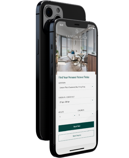
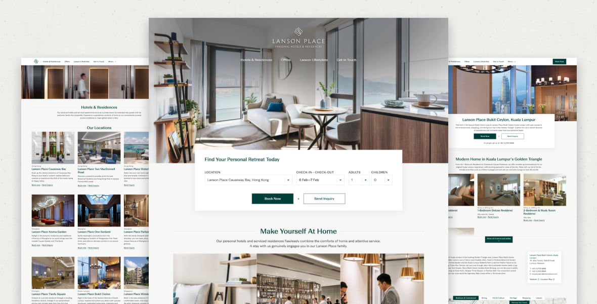
Client Location
Hong Kong & Asia-Pacific
industry
Hospitality
Scope of work
Web design & development
Design system
site link
the brief
Bringing the family together
2020 might have been a difficult year for the hospitality industry, but Lanson Place is pressing ahead and expanding their presence across the Asia-Pacific region.
Their ambitious plans for their 9 (soon to be 11) locations included a full redesign of each of their sites, as well as the central corporate site. These redesigns were to be based upon a new design system and corporate identity conceived by Grayscale and Eight Partnership and implemented over a period of two years.
The planned design system would improve the brand’s personality and identity, with increased guest engagement and bookings through the site, and with staff actively using the site as a reference and promotional tool.
12
total websites
7
cities across asia-Pacific
3
Years of co-operation
User research
Getting to know guests & hosts
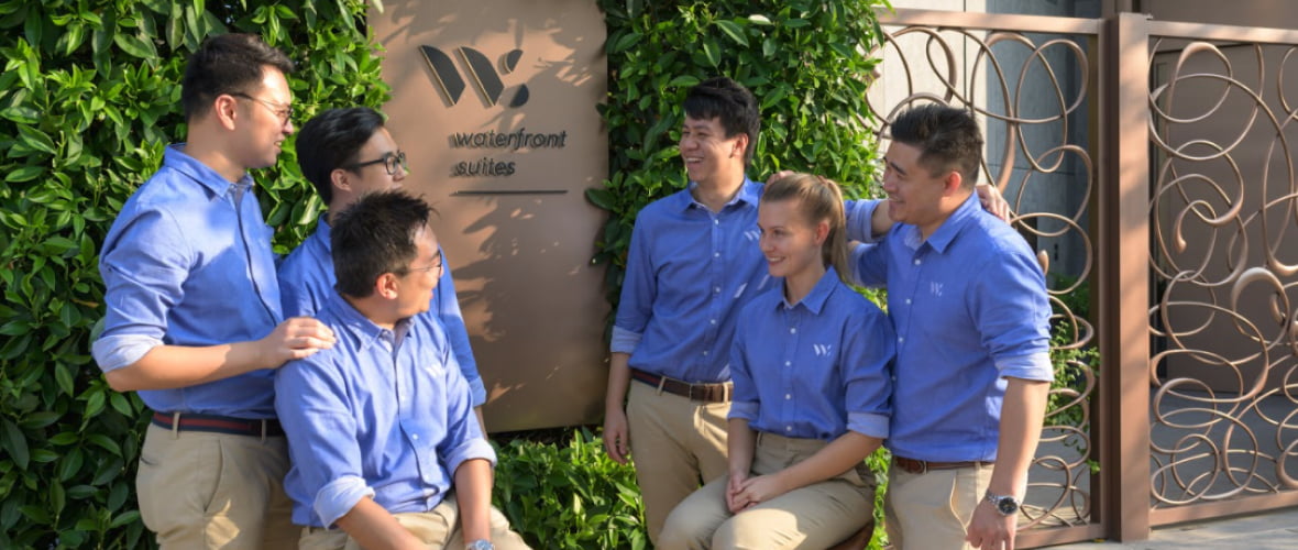
The early stages of this project were focused on information gathering, both in person at Lanson Place’s three Hong Kong locations, and over-the-phone with staff and guests across Asia-Pacific.
After touring facilities, seeing the rooms and talking with staff, we had a proper feel for the level of service that would need to be portrayed on the new site.
We combined these first-hand views with Lanson’s freshly-developed corporate identity to start constructing the base of a web design with the perfect blend of brand expression and guest focus.
Accessibility
Translating brand to web
Working from a base corporate identity, Grayscale applied our expertise in UX and accessibility to ensure their brand guidelines were properly implemented on the web.
For example, we always ensure that colour contrast is high enough between light text and the background, so as not to put a strain on those with less-than-perfect vision.
For more complex parts of the site, such as the booking form, we ensured that the inputs are accessible by keyboard, for those navigating the site without a mouse.
Visual Design
Iconic rooms
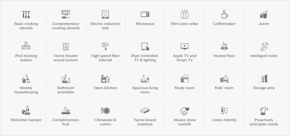
In the course of developing the new design system, Grayscale proposed an expanded icon set to call attention to their rooms’ amenities.
We began by performing an audit of the amenities for rooms across all nine locations. From this, we determined that certain ones could be combined under a single design, which, after a few rounds of iteration, gave Lanson Place a final set of around 30 icons that they can use across all properties, current and future.
Development
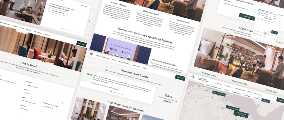
A centrally- structured family
A project as complex as this has many potential pitfalls. Luckily, Lanson Place HQ’s strong leadership guided the property sites and helped to protect and grow the design system.
Built with WordPress Multisite, the family of sites can be easily interlinked, for example aggregating offers, reviews, and careers on the corporate site, and pushing press releases out to property sites.
In order to smoothly transition to this full functionality, we created temporary pages holding the most important information for each of the properties, meant to live alongside the old designs until each full property site was ready to launch.
SEcondary stakeholders
Welcoming new hosts
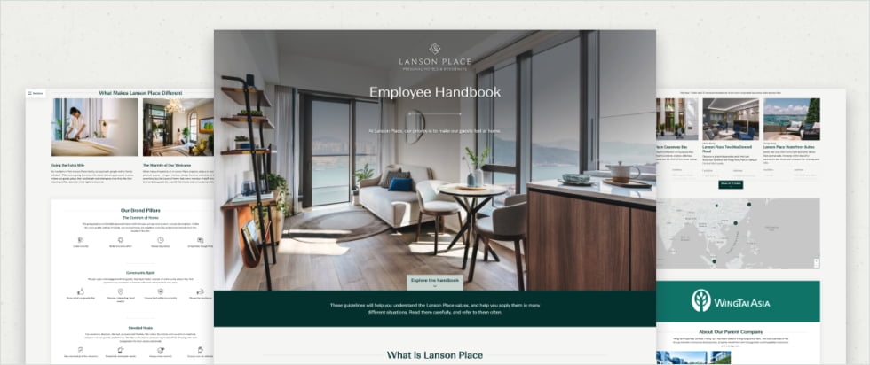
As Lanson Place staff were also a key user group for this project, we developed a password-protected single-page employee handbook for their reference.
Though not a usual request for even large web projects, this interesting add-on functions as an expanded about page to guide new hires and serve as a quick brand reference for existing staff.
Ante-mortem
Continuous improvement
With the final redesigned property site scheduled to launch in 2022, this long-running project has required us to constantly adapt and tweak our design system to fit the steady stream of incoming content.
Staggering the launch dates of the property sites over the course of two years let Lanson Place roll out their new corporate identity as quickly as possible, while also allowing for progressive insight and accommodating ongoing input from property managers.
YOUR PROJECT
Let’s hear that concept
Have a suite of websites to build and don’t know how to start?
Our team can guide you through these processes and together we’ll come up with a unique solution. Get the results you want.
