VGC International College
Building gateways to language and business success in Vancouver, Canada
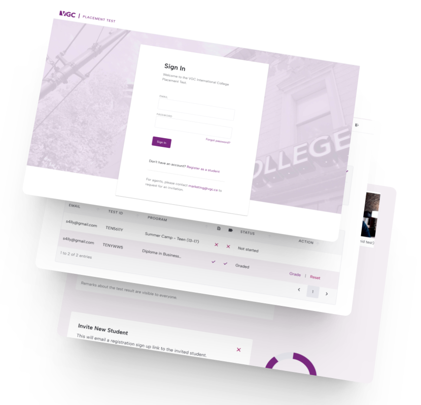
VGC International College's test-taking and student-agent management platform – boasting countless users and offering a multitude of programmes for a burgeoning student community – required an overhaul.


Client Location
Vancouver, Canada
industry
Education
Scope of work
UX design
Web design
Application design
site link
the brief
Redesigning for students’ success
The team was eager to overhaul their existing platform, at the same time eliminating its continuous glitches and non-intuitive steps.
These issues created a disruptive and frustrating test-taking experience for students which, in turn, negatively impacted their academic achievements. Resolving these issues was crucial to building a reliable, user-friendly test platform that supports students’ success.
UX audit
Empathising to solve
The UX issues with the existing examination portal encompassed a long learning curve, frequent glitches, lack of intuitiveness, inefficient grading processes, limited collaboration, complex integration, lack of reporting and analytics, unprofessional admin portal UI, and limited administrative features.
Addressing these issues is crucial to enhance the overall user experience, improve efficiency, and ensure a seamless examination process for all stakeholders involved.
research
Unlocking user insights
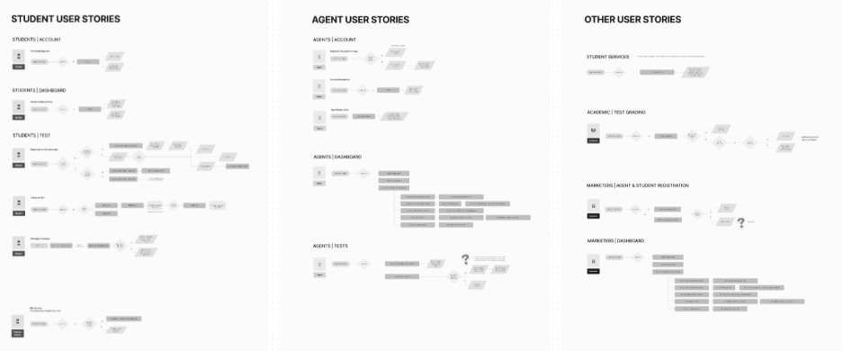
The platform has been widely used by students, their representative agents, the academic graders and the marketing teams.
Delineating these vastly different user flows, needs, and pain points – coming from varying contexts the user operated in – required detailed research.
The existing platform made registration an error-prone, manual process. This resulted in teams signing off during simple tasks, such as student signup, or a new agent registering from an existing agency.

flow mapping
Onto a new examination experience
In trying to connect the dots, a glimpse at their existing user analytics showed us key areas of frustration and confusion.
Competitive research also helped us in seeing different approaches to similar situations.
We looked at adding automations wherever possible, simplifying steps, reducing friction and adding helpful tips.

“Grayscale built two websites for us and revamped our offline marketing materials. Where they excel is in how they engage with you – getting to understand your brand and unique needs, then going the extra mile to execute on their promises.”
— Gerwin, VGC Marketing Associate
visual design
Crafting brands that speak volumes
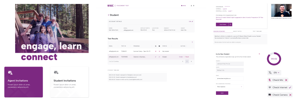
The new examination portal tools provide a seamless, intuitive interface, allowing students to easily access their schedules, submit tests, and receive grades in a timely manner. The implementation of advanced features – such as personalised notifications and reminders – has greatly improved communication and reduced the likelihood of manual errors.
Subtle microinteractions and a decluttered interface helped convert users to key actions. The use of typographical hierarchy was integral to effectively break down verbose information into digestible chunks, enhancing comprehension.
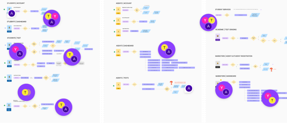
Throughout this process, whiteboarding was an integral part of remote collaboration across our Hong Kong and Canada teams in opposing time zones!


Post-mortem
Revolutionising experiences, one click at a time
Such layered projects span longer timelines for a more sustainable workflow. The revamp of the university portal has significantly transformed the student experience and administrative processes. Through user analysis and stakeholder collaboration, we could identify pain points and design solutions to address the specific needs of students, faculty, and administrators.
Faculty members now have enhanced tools for creating and managing exams, including question banks, automated grading, and analytics. These features not only save time but also enable instructors to gain valuable insights into student performance and tailor their teaching strategies accordingly.
From an administrative standpoint, the revamped portal has streamlined processes, reducing paperwork and manual data entry. The integration with existing university systems has improved data accuracy and enabled efficient tracking of student progress, ensuring transparency and accountability.
Your project
Let’s hear that concept
Grayscale works together with you to find the best solutions, balancing your and your users’ needs, brand values, budget, and other variables.
Not only can we translate your existing offline identity onto the web, but we can also help improve your users’ digital experience.

