Typeface? Huh?
Assuming you’re not a designer, what do you think of when you see the word “typeface”? Never seen it before? Well, how about this one? Font.

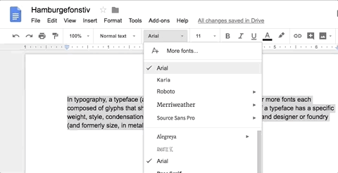
You scroll through this long menu, looking for a font to make your document look nice and cool. Maybe you’ll pick Arial instead of Calibri… oh, there you are, Comic Sans!
Once in a while, you might also hear people talking about buying fonts for a project… “But there are so many fonts on my computer already,” you think, “Why can’t we just use one of them?”
If you find yourself nodding in agreement at the above, then I hope you’ll keep on reading, as this article was made just for you!
Typeface vs. Font
So now you do what people usually do—ask Google and click on the first result, landing you on Wikipedia:
In typography, a typeface (also known as font family) is a set of one or more fonts each composed of glyphs that share common design features. Each font of a typeface has a specific weight, style, condensation, width, slant, italicization, ornamentation, and designer or foundry (and formerly size, in metal fonts)…
Blah blah blah. You’re probably feeling even more confused after reading this. Let’s try something else and use a metaphor from the fashion industry to make this all a bit more relatable.
You must have at least seen the Harrington before—this jacket has regained popularity in recent years due to its practicality and classic design. Throughout its history, it has been produced by different fashion brands at different price points. Nevertheless, every Harrington should always feature the iconic funnel collar and slanted flapped pockets.

If you weren’t scared away by this primer on the Harrington, then you have all it takes to understand the difference between a typeface and a font!
When we say “Harrington,” what we mean is the design: the cut of the jacket, its funnel collar, and its slanted flapped pockets. In typography, we refer to the design of a set of letters as the “typeface.”
Now how about the physical form of a Harrington? It is a piece of clothing, usually made of cotton fabric, stitched together according to a specific design. Back in the good old days of typography, “font” referred to the metal blocks, moulded in the form of a typeface, that printed the letters onto paper.
Nowadays, digital files on your computer have replaced the crates of metal blocks. Regardless, this tool which helps you to print letters is still referred to it as a “font.” Got it?
You might be thinking, “Can a single typeface be produced by different companies, just like the Harrington?”
The answer is yes!
This usually happens when different companies digitise an older font from its metal blocks, one notable example being Futura. Search for “Futura” on MyFonts.com and you’ll find hundreds of variations, made by different companies at different price points. Since these are all reproduced based on the first set of metal blocks, they mostly stay true to the original, while still adding a bit of the designer’s personal touch.
In a nutshell, “typeface” is how you refer to the design and “font” is how you refer to the digital file.
Carrying your message
“Okay cool. I can wear a Harrington to keep myself warm, but a typeface can’t do that, can it?”
Believe it or not, a typeface can make you look warm. And the wrong typeface can also make you look pretty dang stupid.
The ultimate goal of a typeface is to provide a medium for written communication. Think about this, how do you make your words seen? You either handwrite it, or you type it. If you type it, a typeface is always required to show the words you’re typing. You can imagine a typeface as the messenger bringing your words to the reader.
Your choice of typeface serves different functions, one of them being to provide context for your readers.
Returning to the fashion metaphor, when you see someone in a sporty outfit, you perceive them as sporty. When you see someone wearing a suit, you see them as a businessperson. Similarly, typefaces provide distinct visual context, allowing the reader to understand you and your message with just a quick glance.
Typefaces like Livory and VAG Rounded offer a warmer, more personal feeling when compared to the emotionless Arial. Using typefaces like these makes you more approachable. Are you feeling warmer yet?
Livory


VAG Rounded Next

Arial


And we’ve all seen Comic Sans, the one typeface guaranteed to make you look childish and unprofessional, right? Yet, even this is not always the case.
Clearly, using Comic Sans without matching the context makes your message inappropriate. It’s like wearing pyjamas to a black-tie party. But likewise, using Garamond can also be like wearing formal attire to a sleepover. Context matters—so pay attention to how you present yourself.
Remember how I said typefaces serve different functions? Well, Comic Sans is actually a great example of another function: serving the special needs of the reader.
Even with its bad reputation and poor design quality, Comic Sans is one of the few typefaces easily readable by people with dyslexia for two reasons: the irregular shape of its letters, and people’s familiarity with it.
Since the goal of typefaces is to help us communicate, then perhaps readability must sometimes take precedence over presentation. Just like how you wouldn’t wear business attire to play badminton, even if you are a businessperson—it just doesn’t fit the situation.
Though this doesn’t happen often, it does prove that picking a typeface can be complex. The decision-making process requires the evaluation of both present and future limitations and priorities.
When choosing a typeface, we should always aim for a balance between functionality and aesthetic, while also being ready to sacrifice one for the other.
Coming soon
I hope this article has provided a good introduction to typefaces for you. Hungry for more type topics? Check out the post on our first-ever typeface, and stay tuned to our blog. More future posts will expand the discussion to the impact of typeface choice on branding and the practical implementation of fonts on the web.
And in case you have any questions about typography or typefaces, we at Grayscale are more than happy to help you out! Feel free to shoot us an email at hello@grayscale.com.hk.