Fun. Failure. Farro
Your first-ever of anything is memorable. So here’s the story of how we’ve created Farro: Grayscale’s first-ever typeface.

Let’s do something new
It all began around September 2017. It was a gray morning outside our Hong Kong office. The typical on-and-off rain and thunderstorms that are trademark for the typhoon season were dampened people’s spirits: just another Monday.
During our morning caffeine routine chat, an idea strikes: why don’t we create a new typeface for our own Grayscale brand? Whilst I mainly do development work at Grayscale, my real passion are typefaces (as such I bother everyone here incessantly about making right type choices), and I have made typefaces before. The reaction was simple and positive:
“Hey Aceler, you know how our current display type, Circular, is also used by Spotify and AirBnB and a whole bunch of others? Maybe it’s time to design our own typeface.”
Yeah, that could be fun. Let’s give it a try. How should we approach it?
Fun
With so many entry points for approaching the project, we went ahead to look for type references with characteristics that may work as a replacement for Circular.
We quickly overwhelm ourselves in a sea of type samples with the sample sentence: “Our web projects offer simple solutions to complex problems.”
One by one we filter out all the ones we don’t see fit. I still remember that all the geometric sans samples got axed first: clearly we really wanted to stay away from what we already had.
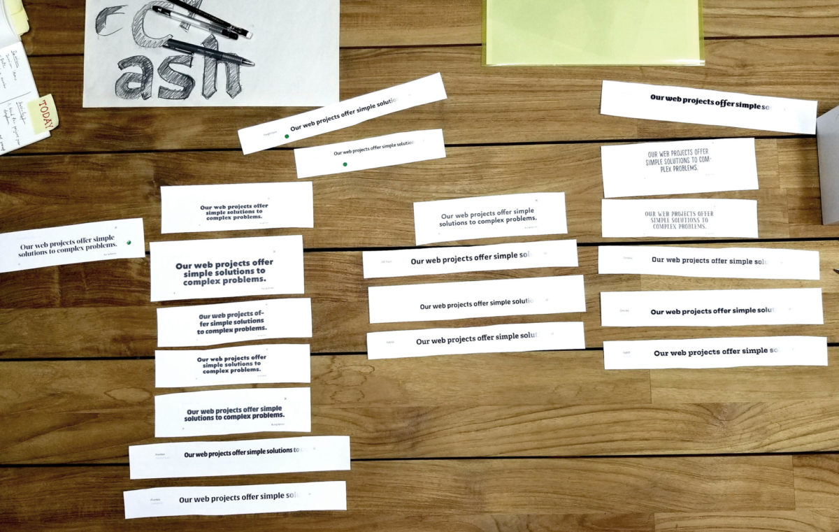
So here are the ones which survived the first shift.
We were looking for a typeface that offers a human feel, whether or not it’s a serif or a sans seemed secondary. There had to be a great deal of personality: particularly we wanted it to be joyful and friendly (like us!). We identified the following as our criteria for the typeface:
- Tall x-height for the optimistic feel
- Humanist silhouette to make the design a bit more, you know, human
- Low contrast to give the design some ease
After we agreed on these parameters, we took the process to the drawing board.
At first, we made an angular, rather humanist sketch, but after just three characters we already felt the shape was a bit too old for us. More playfulness was needed.
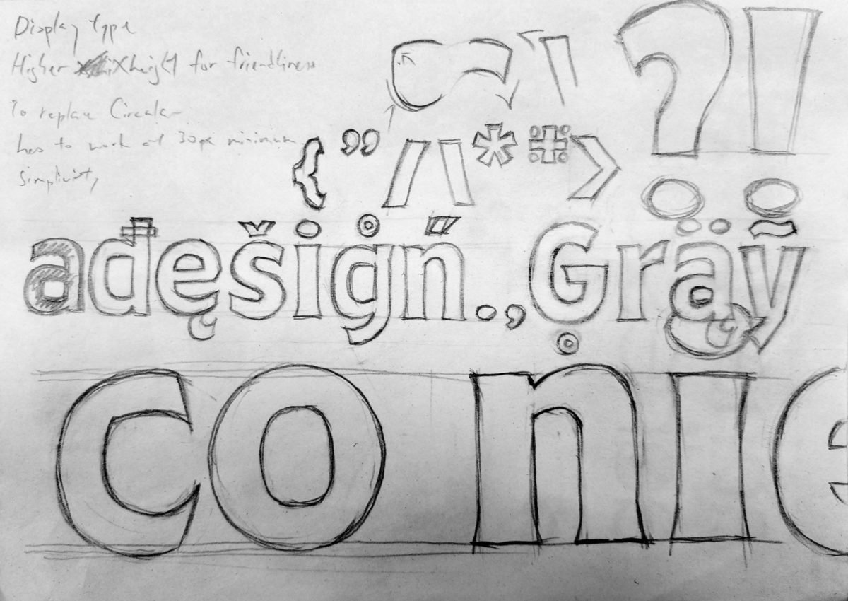
So we tried another sketch. Straight away this felt a lot better. As you have noticed, we also played with some diacritics to see how it could/should look, even though we didn’t think much about language support in the beginning (more on this later).
The sketches began to look promising. A lot of fine-tunings would be done in the digital production anyway, so we decided not to waste more time on more sketches and brought the process to the computer.
Failure
So I sat in front of my computer, open up Glyphs, clickity-click, clackity-clack. Soon enough I already got the first eight characters done: adhesion, which is my standard test string. We tested the design on other words composed of these same eight characters and the balance looked promising.
But man, there’s something to the shape of it. There’s a lot of personality—it’s joyful, yet quite sturdy. The character design aligns with Grayscale’s personality: professional yet fun and friendly, so naturally, it felt like a good fit. Boosted by this optimism for the project, I was strongly motivated to create more glyphs.
Well, it wouldn’t make for a very interesting story unless something went wrong at some point, right? By the time I finished all the lowercase characters in the basic Latin set (you know, the 26 alphabets) and a few uppercase characters, I had an an urge to try Farro on our website. As I’m opening our site and subconsciously clicking through the dev tools, a nagging thought hits me: why have I never checked the design with our own collaterals? As the screen refreshed and my conscious mind takes over, one thought appears:
Heck nope.
The organic, humanist design of Farro just did not match the geometric visual style of our brand; the tech punch overrules the Grayscale branding. I showed it to the team and as everyone shook their head, we quickly agreed that it was indeed a bad match.
Calling the shot
As we had recently rebranded Grayscale, adjusting the brand to Farro was unpractical and out of the question. So now we were facing a crossroad: On the left, the path where we start over to design another type from scratch for the Grayscale brand. On the right, it’s a path where you know Farro will live happily ever after, albeit not a life with the Grayscale brand.
We turned right.
It wasn’t difficult for us to make the call. We like our brand identity, and while it continually evolves, we weren’t desperate to review the display typeface. There is potential in Farro to flourish on its own, so we agreed to build on it. Farro was conceived out of curiosity, not necessity.
Farro
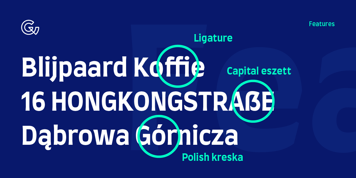
We began expanding on the typeface. At first there was the basic Latin set with some punctuations and symbols in only bold weight. Then we added Western European characters to it. In particular we’ve had a lot of fun (and tears) making both the upper and lowercase German Eszett (ß).
After the west, we focused slightly towards the east with Central European characters. I’m a little familiar with Polish, so I created the ogonek (little tail) and learned that kreska (stroke) is actually more upright compared to the regular acute.
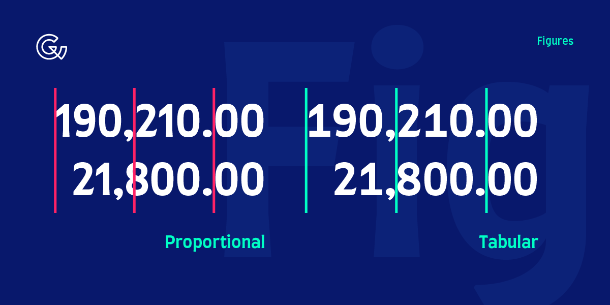
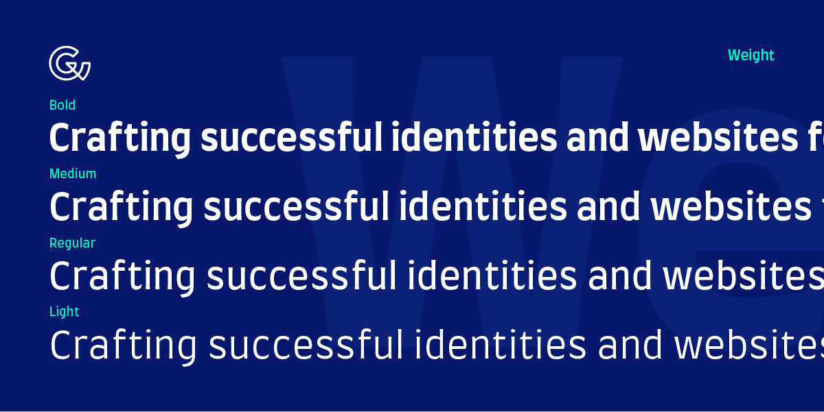
Designing a typeface is like a never-ending story. Once you got one part done, there’s a whole bunch others waving for attention. After letters there are numbers, punctuations, symbols, alternatives, kerning, another weight; and so on. If you don’t decide to stop expanding on it, it’ll never get released.
So we learned how to approach a type design project. Once it’s good enough, get it shipped; make expansion, get it shipped; complete a new stage, get it shipped.
We worked on Farro till it reached a point where the spacings and contours are relatively stable, and expanded into a font family with four weights, and most importantly: we’re all pleased with the result. And so, almost a year later, on August 28th, 2018, we’ve launched our first typeface: Farro.
Check it out and spread the word
We’ve also created a promo site for Farro so you can experience the typeface at your convenience without downloading the fonts first. However, you’re welcome to download the fonts because we’ve released it at no charge for commercial and personal use!
We’d love to know what you think about Farro. Email us at hello@grayscale.com.hk to tell us what you think or if you’ve used Farro somewhere, we’d be happy to feature you. After all we’re making Farro because we’re curious, we want to learn from the process and improve our skills, so your comments will help us grow.
And if you’re interested in getting a custom typeface made especially for your brand, we know exactly how hard it is to get it done in Hong Kong. Let us know your requirements, contact us now and let’s talk about it.
Hope you enjoy Farro and hope it stays with you happily ever after.