Webconf.asia does a #02
Thought-provoking talks and informative workshops for web creators return to Hong Kong for the second year running!
Webconf is back and it’s growing! While last year’s conference featured 8 wonderful speakers and an all-day design seminar, organiser Charis Rooda has brought even more to the table this year. Two full-day workshops, two days jam-packed with talks, and a diverse cast of speakers ensured there was something of interest here for every web creator!
For me, the range of topics at Webconf helps achieve balance. Keeping a thought for the future in mind, I can level up my craft with specific design, development, and client skills, while also winding down with exploratory side projects.
The Grid
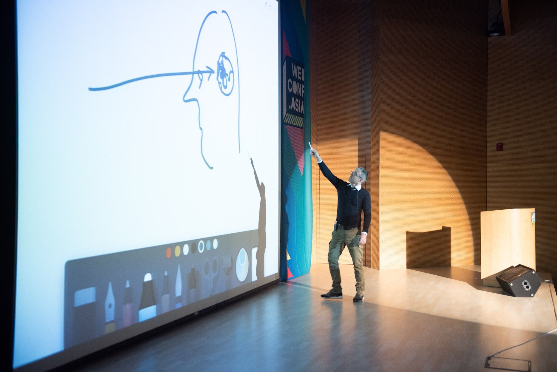
Rachel Andrew’s CSS Layout Workshop
Welcome to Webconf! Despite not being a developer, I do occasionally code up the small side project or quick prototype, so I was looking forward to a nice refresher, as well as finally learning Grid Layout, something I’d been hearing about for a while. And all from a world-renowned web expert, no less! Sure enough, Rachel Andrew welcomed us all in bright and early and soon got down to business, diving right into the exercises!
Much to the relief of the four designers in the room, we began with a quick review of web layout to date, blazing through a short tutorial of Flexbox (no sweat). Understanding Flexbox is an important prerequisite for working with Grid, since many of their attributes do overlap. However, the important distinction comes in how you use them:
For flowing, one-dimensional lists, Flexbox is the answer. For 2-dimensional data and full-page designs on the other hand, Grid’s layout system is clearly superior.
Despite being a new concept to me, I could easily follow along with Rachel’s teaching style. Once we had the basics nailed down, the grid-template-areas spec emerged as my new favourite feature. This allows grid areas, once defined, to be allocated like ‘ASCII art’, as seen below:
grid-template-areas:
"header  header  header"
"sidebar content ......" // periods define empty areas
"footer  footer  footer";
Since Rachel is part of the CSS Working Group, she also peppered a few hints throughout the workshop about new features coming down the line. Things like Pinterest-style masonry grids, styling of individual grid areas, and display: subgrid are just a few of this things we can look forward to.
Though now supported by every major browser, CSS Grid Layout is still relatively new, only having been introduced by Internet Explorer in 2011 (thanks Microsoft!). Meaning: we still have to break out the feature queries and worry about backwards compatibility, at least for a bit 😕. But as always, the focus should be on on accessibility over pixel-perfection (and I think Jeremy would agree).
The Colour
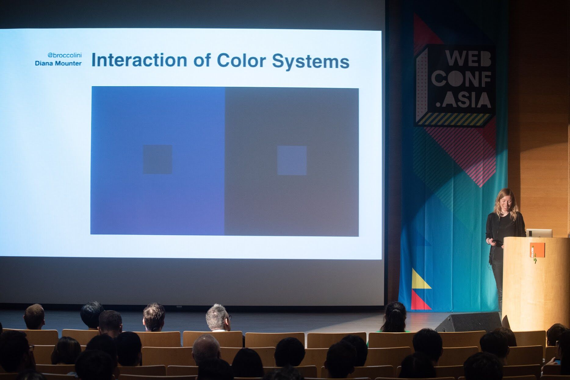
Colour systems with Diana Mounter
After a day of digesting the CSS workshop, it was now time again to focus on designing. Designing colour systems, to be exact. For me, colours are defined by colour-pickers and hex codes, but such abstractions just can’t capture the full range of our subjective, multicultural world. I often find myself designing in circles when it comes to colour, it being too often overlooked in today’s design educations. That’s why I really enjoyed Diana’s practical, start-from-scratch case study on systematising colour in the real world.
Diana’s trial-by-fire while at GitHub was to optimise and refresh the colours used in Primer, their design system. Taking stock of the situation, she saw a whole lot of similar colours, undocumented patterns, and elements built without reuse in mind, all leading to a lot of unnecessary CSS. Working through the project, she pulled out a few nuggets of wisdom for us to keep in mind:
- Prioritise highly-used combos first: make sure to keep perspective on the project as a whole and not get bogged down in the weeds.
- Retain colour meanings; some symbolism is quasi-universal: green is positive, yellow is caution, and red is danger. Be careful not to conflate these usages with brand colours or other interface elements.
- Tint grayscales cooler or warmer to subconsciously complement main colours and create unity.
Lastly, as with any design project, colour systems must also test and take user feedback into consideration. For example, when a change in GitHub’s folder colour prompted community uproar, well, sometimes you just have to appreciate users’ passion for your product! And it’s not only user, but also internal feedback that matters! Make sure you’re selling the engineering benefits of a small-as-possible, unified, and clear system, too. These systems can live on well beyond your tenure, so it’s critical to work with intention and awareness!
The Captain
Navigating choppy waters with David Wieland
Grayscale represent! Working with David these past few years have given me not just incredible design experience, but also valuable insight into how client relationships work. They might not always flow as smooth as we’d like, but with eight years of projects large and small behind him, he was ready to lay out his strategy guide for #happyclients.
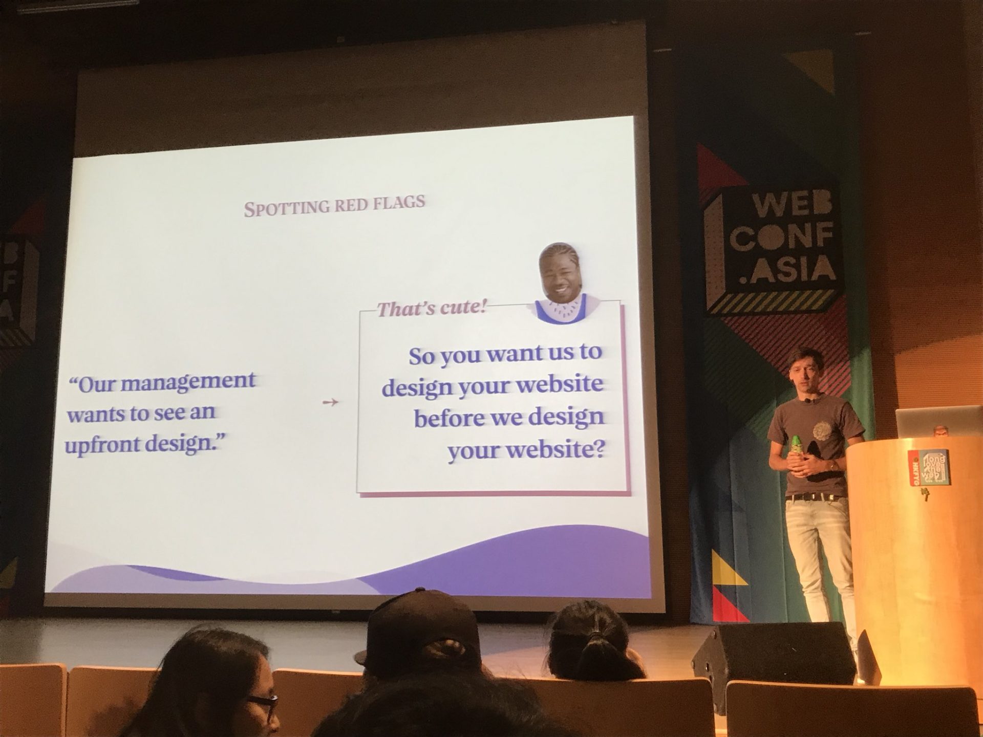
Good captains know how to spot dangers and assuage concerns. If you work in an agency, do you know how best to handle these situations (without killing the project—or your client)?
- There’s “no budget”? Suggest one to judge their reaction!
- Must launch by a fixed deadline? Better be consequences if their (in)actions push it back!
- Client needs upfront design? Educate them! Is that really how they treat other vendors?
- No direct contact with decision makers? Reconsider or be prepared for a “swoop’n’poop”
- Sailing too smoothly? Make sure client is actually paying attention to progress!
Fact: clients may get anxious. But you don’t have to. Take a deep breath and… listen. In moments of heightened emotion, all a client wants is to be heard. Let them know their concerns are valid and you will discuss with your team.
So you’ve made it to the other shore and are wrapping up the project on a good note—wonderful! But hold up. Just because the site is live, doesn’t mean you’re parting ways with your client forever. Get the team together one last time to let everyone reflect on the project’s successes and failures… who knows what the future may hold!
The Philosopher
Oliver Reichenstein’s design ethics
Just after being convinced we could balance client desires with real-world constraints, Oliver decided it was time to drop a big, heavy moral compass into the mix. However, it was great to pull away from technical details for a while and really consider the longer trajectory of design and technology in our world.
Oliver wants us as creators to take not just one, but many, many steps back and view our industry from a long-term, philosophical viewpoint. What philosophy represents us (or our company)? Is it a focus on happiness above all else? A more utilitarian view of pleasure for the greatest number of people? Or can we provide a more universal connection allowing humanity the freedom of will?
Inspecting the World Wide Web through his lens of philosophy, Oliver showed us how these thoughts can indeed influence the structure of our lives. What was initially conceived as an equally distributed network has now coagulated into just a few companies amassing and more weight on the network. And if enough nodes on this network are controlled, explicitly or through influence, so too is the information flow for a majority of the world’s population.
So, how can designers and developers fight for what is right? How can we even define right? That, like all philosophical questions, should become your own internal struggle, but in the eyes of Oliver, we should use our influence to break through corporate centralisation and architect connections on a personal basis. Let’s keep the future human.
The Weird
The curious creations of Tim Holman
Tim’s wonderings are really my jam. It was super inspirational to see someone so passionate about something so non-productive and encouraged me a great deal to stray even further from my comfort zone. Looking forward to making really interesting things in the future!
To stay creative, we need to stay weird. Remember back when you were a kid and you made something just because you wanted to? Just because it didn’t exist in your little world? Do you still have that desire? Hammering away on side projects and startup ideas could turn you into a unicorn… or just burn you out.
In this talk, Tim shared with us just a few of his wacky, useless, yet still learning-filled projects from over the years. Sometimes, the tiniest distraction leads down a rabbit hole of coding, math, and psychology… all to produce the most optically-pleasing DVD player screensaver! Other times, you just need to destress. His Zen Zone may be useless, but then again, so is raking a real-life zen garden. Let your mind wander for a while and who knows what connections it can put together! Life ≠ work! Take time off to be weird!
Winding down
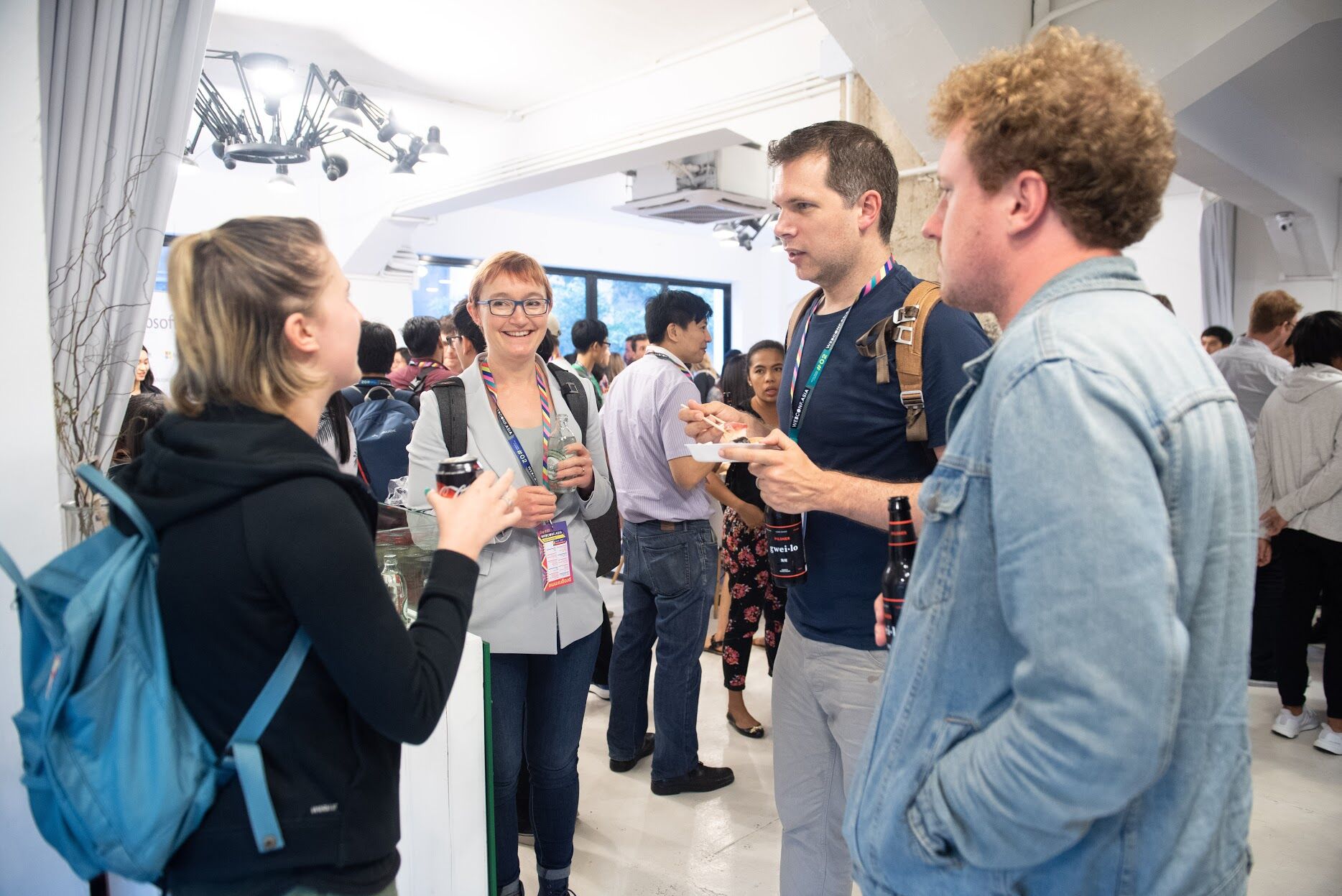
After an exhausting day, many of us headed down the street to the Microsoft afterparty for drinks and mingling. Sushi, local beer, a retro arcade cabinet, and a HoloLens demo made for a good background to chat with colleagues and speakers—and what a great bunch they were!
TL;DR?
Take care of yourself, your clients, and your company. Consider your place among humanity and in the world, and the power we have as web designers and developers to influence it (but don’t forget to stay a bit weird 🎏).
The Speakers
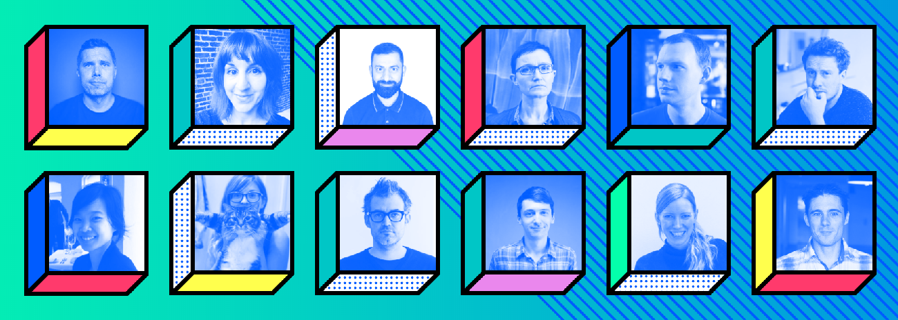
This year’s 12(!) speakers represented a great diversity not only in gender, but in global background and discipline as well. From agency/freelance designers and developers to big company product designers, news journalists, hackers, and philosophers, the more voices the better! For many, this was also their first time in (a sadly rained-out) Hong Kong.
Phil “The Dream Crusher” Hawksworth, Promoting Performance from the Ground Up
After experiencing one too many botched product launches, Phil made it his life’s mission to never again let deployment plans go off the rails due to a lack of planning or version control. Good thing Netlify’s on board.
Val Head, Choose Your Animation Adventure
Val’s energetic exploration of the range of choices available to today’s web animators was a great start to morning #2. CSS, JS, SVG: pick your flavour!
Asim Hussain, How to Hack a Web App?
With the explicit goal of, “making you pee your pants in fear,” Asim’s talk showed us all just how easy it is for your next project to be compromised… so double check your npm package names and Don’t. Trust. Anyone.
Rachel Andrew, Unlocking the Power of CSS Grid Layout
CSS Grid Layout can seem daunting if it’s been a while since last coding… Fortunately, Rachel took us all back to school with her workshop and talk to educate us on why Grid is the answer for 2-dimensional layout.
Jake Archibald, The Event Loop
Jake’s beautifully-animated abstractions and live examples helped bring light to the oft-misunderstood processes within the browser event loop.
Tim Holman, Weird Wacky Wonderings
This was absolutely my jam: Tim took us through his history of “mindfully weird” art, design, and zen web interactions.
Jane Pong, Data Visualisation in News: The Creative Process
Moving from a science-based education into the journalism sector, Jane gave a unique perspective on producing and distributing truly responsive infographics.
Monica Dinculescu, Fontastic Web Performance
Beware FOUT and FOIT; make sure your web fonts aren’t bothering, or worse, misleading your users with some typographic best practices.
Oliver Reichenstein, Design Ethics
What a departure from the rest this was! Oliver dove deep into philosophy through the ages and implored us to question what the real goals of the big internet companies of today are… and whether we’re helping them or humanity.
David Wieland, Navigating Choppy Waters
Grayscale’s very own took us on a high-seas journey through all the woes that can befall the client-agency relationship and how to disembark with your sanity intact!
Diana Mounter, Interaction of Color Systems
Using colors with intention to bring cohesion and clarity to GitHub’s design system, this was a great journey touching on almost every aspect of digital product design.
Mike Riethmuller, Strategy Guide for CSS Custom Properties
Using SASS? Will you still be using it next year? Mike presented a future where variables and logic are kept right within your vanilla CSS files. Readable code > ‘clever’ abstractions.