Think like it’s 1995; code like it’s 2035
A workshop on web resilience and progressive enhancement with Jeremy Keith.
On a crisp February morning in downtown Hong Kong…
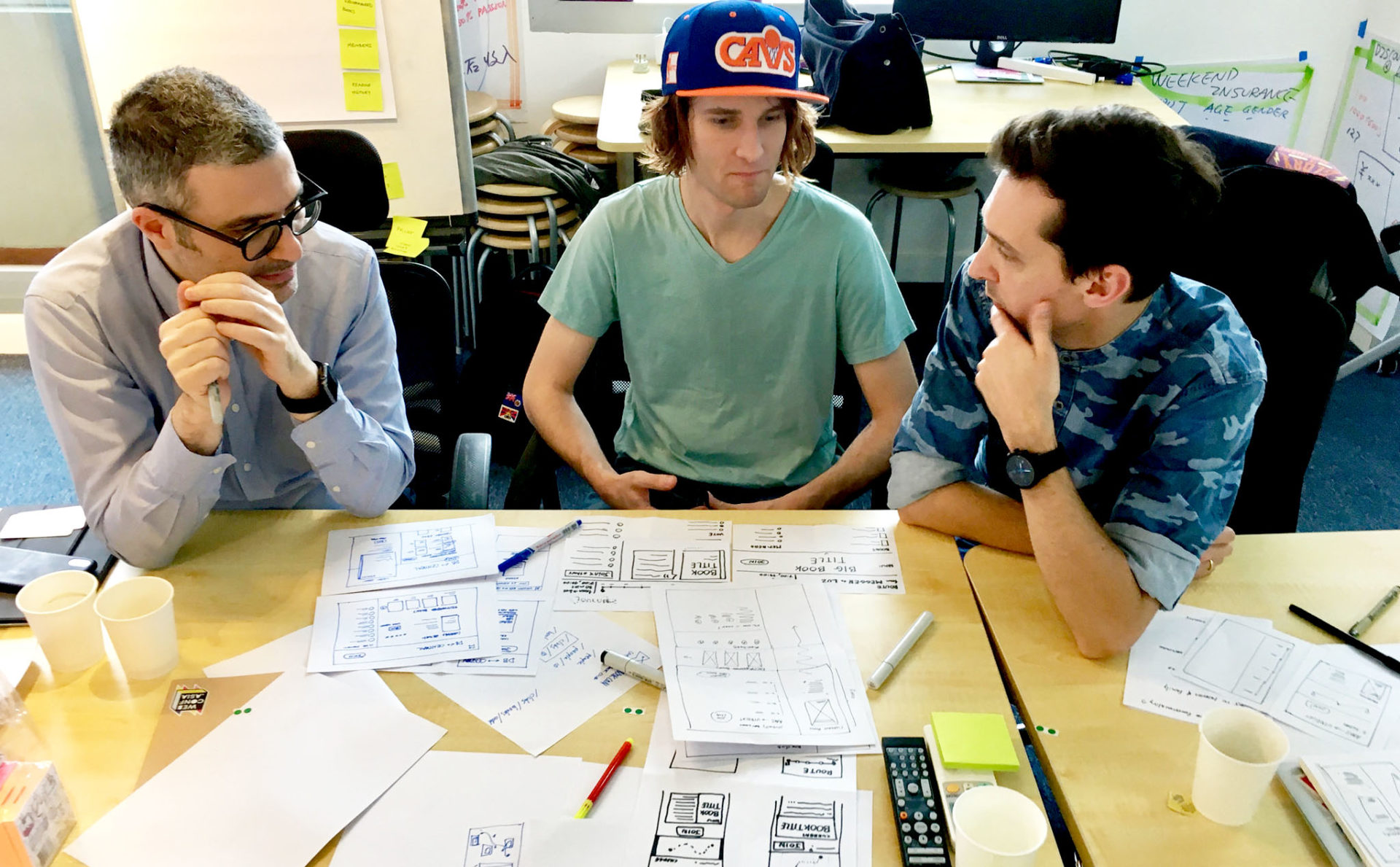
Thanks to Charis Rooda, the organisational talent behind Webconf.asia, and consultancy company Odd-e, a dozen web professionals were congregating in a harbour view conference room, getting ready for a full-day workshop with internet pioneer Jeremy Keith. The topic? Building for a resilient web. Once food, coffee, and pleasantries had all been exchanged, we were ready to dive in — or rather, back — to the year 1995.
Starting from the basics
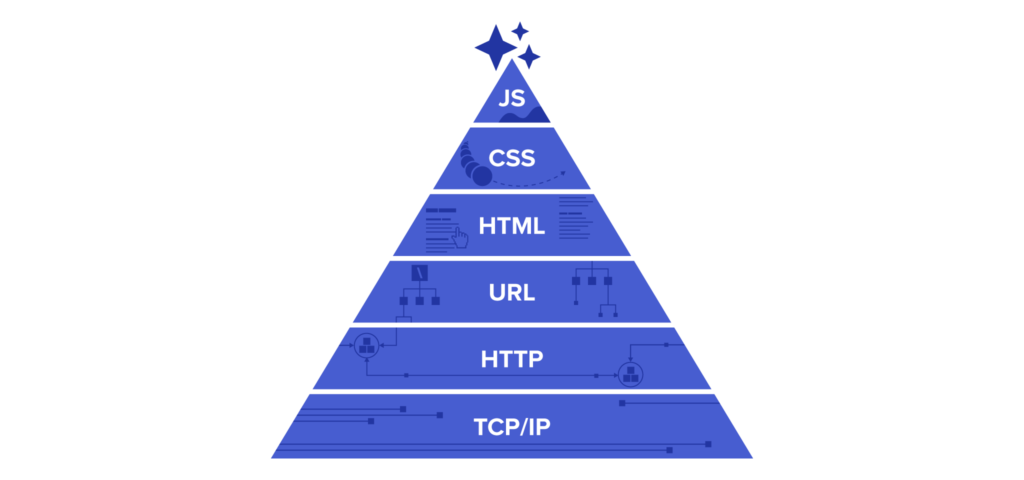
If we want to build a resilient & accessible web, we need to do it the same way architects construct resilient buildings: from the foundation up. This means not overlooking the importance of semantic URLs and HTML, and the graceful failure of everything more complex than that. HTML and its supporting services enable almost all core functionalities of every major web service, so theoretically, any app today could exist 20 years ago, just in a different form. Jeremy lead us through the thought experiment below, allowing us to ‘x-ray’ our modern-day apps in a few simple steps to see how resilient they truly are.
1. What is the core functionality?
Think in simple phrases: Spotify? Listen to music. Facebook? Share with friends. Amazon? Shop for products. Focus on fundamental, meaningful verbs that transcend the screen: buy vs click, shop vs swipe, try vs drag.
2. What is the simplest tech that can enable that functionality?
Now we’re back in 1995 with our app ideas. We might not be able to stream music or videos, but we can still search with a form element, then offer up a download. A news feed won’t auto-update, but we can still refresh the page to GET and POST information.
3. Progressive enhancement time!
Now, think about what we can do to make that core functionality more accessible — style and lay out information more clearly with CSS, update page elements with AJAX, and offer more user interaction with JavaScript! If we think about building our web projects in this order, instead of pondering how the latest and greatest JavaScript framework can open up a few shortcuts, not only will our apps work in a hypothetical 1995, but they’ll also work for people only able to afford outdated devices, people forced to access through proxies, and even for people using assistive technologies!

Building the resilient web, today
After a well-deserved lunch break provided by Knead, it was time to launch some startups! While Jeremy distributed topic cards among the groups, we thought back to his words on how a truly resilient web service can only be built up according to the hierarchy of the internet itself, each layer of the pyramid enhancing, not replacing, its foundations. As designers, our work would begin at the URL.
Keeping this structure in mind, we discovered our topics of ‘commuters’, ‘sharing’, and ‘books’, meaning we soon got to work building a (resilient) book-sharing platform for commuters!
URL design
With our core functionality defined, we could start designing… the URL structure? Instead of flipping open our sketchbooks to start cranking out wireframes, Jeremy first had us think through this oft-overlooked part of the design process. A clear hierarchy of URLs keeps a site semantically organised and goes hand-in-hand with the creation of an information architecture. Some questions to ask oneself during this stage include:
- What is the base URL? What does that communicate about the site?
- Will the base URL be prefixed (eg. service.company.com)?
- How many levels deep is the structure?
- What kind of information is provided at the lowest level?
A great example of a well thought-out URL structure is GitHub’s: domain / username / project name / structure / version / action (ex. https://github.com/heldrida/react-punkbit-site/tree/master/config). This structure helps a visitor from an outbound source to quickly regain orientation and even change the path of the URL to find their contents faster.
HTML design
With our information structure in place, we can finally start thinking about page content. We zeroed in on the most important page (for us, joining a ‘book club’) and began listing out all the content elements we could think of. Of course, we next had to prioritise them — nothing can be equal! This is where mobile-first thinking comes in handy. On small screen sizes, information is almost always stacked vertically, so we must heavily prioritise our content regardless. Starting small just forces us to confront that fact sooner than later. Keeping our basic HTML elements in mind, we slowly transformed our stack of post-its into roughly blocked-out sketches. No styling yet, though!
CSS design
Finally we can start to add some styling and layout with CSS, and along with that, move our designs up to tablet size! What can we add to make the app even better and more user-friendly? With CSS we can of course position elements more precisely with floats, flexbox, or grid. Visual styling differentiates our branded site from everything else on the internet.
JavaScript… and beyond!
Only now, once every other layer from the foundation up has been taken care of, can we consider enhancing our application with JavaScript (frameworks) to give our visitors on the highest-end machines the best experience.
Progressive Web Apps
Thinking beyond basic JavaScript frameworks is vital for future-proofing your site. Building sites as progressive web apps means they are, by default, more accessible; even if you only provide a simple custom ‘connection lost’ page. Jeremy’s the expert, though, so if you’re interested in building your site as a PWA, then why don’t you check out his post: What is a Progressive Web App? Or, if you’re more in the mood for a bit of satire, then read through Heydon Pickering’s Progressive Enhancement Makes Me Sad.
Final Thoughts
1. How well does it fail?
If someone who can’t use JavaScript views your site, what do they see? A blank white screen or basic styled content? What do you want them to see?
2. Who benefits your decisions? The developer, the designer, or the visitors?
Every decision is a trade-off, but your product is ultimately always made for a user. If you always design what’s easy, you’ll end up with fast food. If you only develop with simple frameworks, you’ll never push the bounds of technology on the web.
3. How do your tools’ philosophies influence your design?
If your first approach to an idea is within the context of a design tool, then you’re already bound to using text, shapes, and styles. Move up a layer of abstraction to consider your product’s interpretation through any possible means of access.
4. What’s next?
How can what you’re building exist and grow an unknown future? Progressive enhancement doesn’t only mean backwards compatibility. It also means looking forward as best as possible to ensure what you build not only works in 1995, but also in 2035.
My takeaway
It’s always nice to get a reminder to pull back to the basics. It’s easy to jump straight from features to the latest JavaScript hotness or the newest design trend, but to step back to the requirements of the most basic user of your service requires discipline. What devices are they using, what network are they on and how are they accessing you site? This doesn’t mean you can never build cool, paradigm-breaking experiences for the web, it just means the experiences must suit the visitor.
Jeremy, it was a pleasure to work with you and you are always welcome here in Hong Kong! Happy building!
Jeremy’s blog post on the workshop →