Bring your illustrations to life with gradient and grain
As an illustrator, you may sometimes find yourself wondering how to make your graphics stand out from the pack. Having struggled with this myself and having discovered some solutions, I would be happy to share some of my techniques on adding a bit of depth to your work.
To create eye-catching illustrations, I often opt for a gradient and grain effect. The gradient tool helps to create a beautiful colour progression across the main graphic, while the grain effect is a nice way to generate the mood of the piece. Of course you can use either of these on their own, but combining the two often produces impressive results. Let’s see how it works!
Methodology
Defining light and shadow
Before working on your illustration, it is important to consider the light source and shadow locations. Having a consistent light and shadow tone will make your illustration look natural.
Applying gradient and grain effects
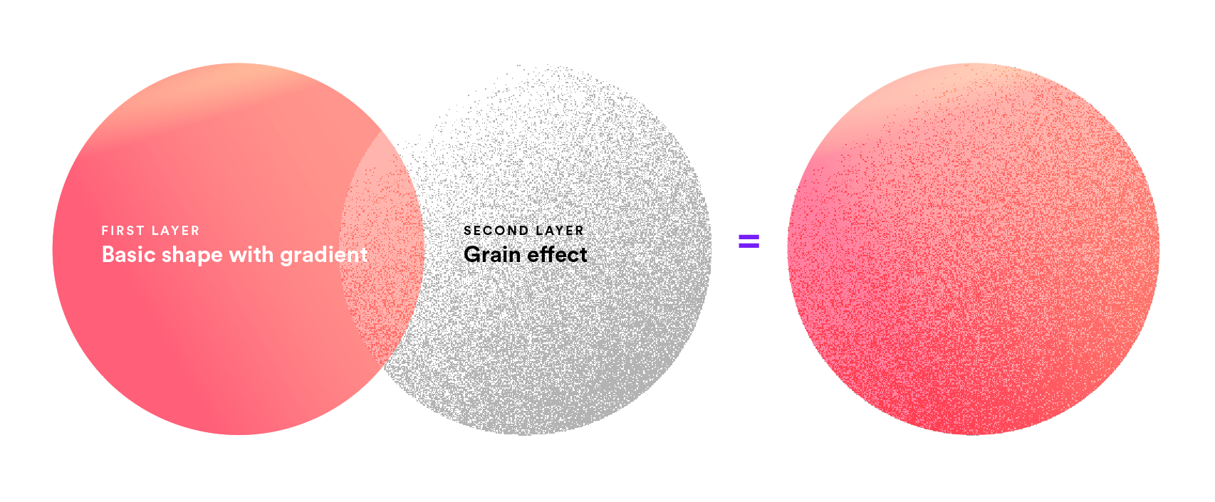
Getting the light and shadow right then determines how the gradient and the grain effects are applied. In theory, the grain effect is an additional layer on top of the shape. By blending it with a gradient, it results in a grainy graphic.
For easier understanding, I will demonstrate below how to make use of the gradient and the grain effects.
Step 1: Identify the light source
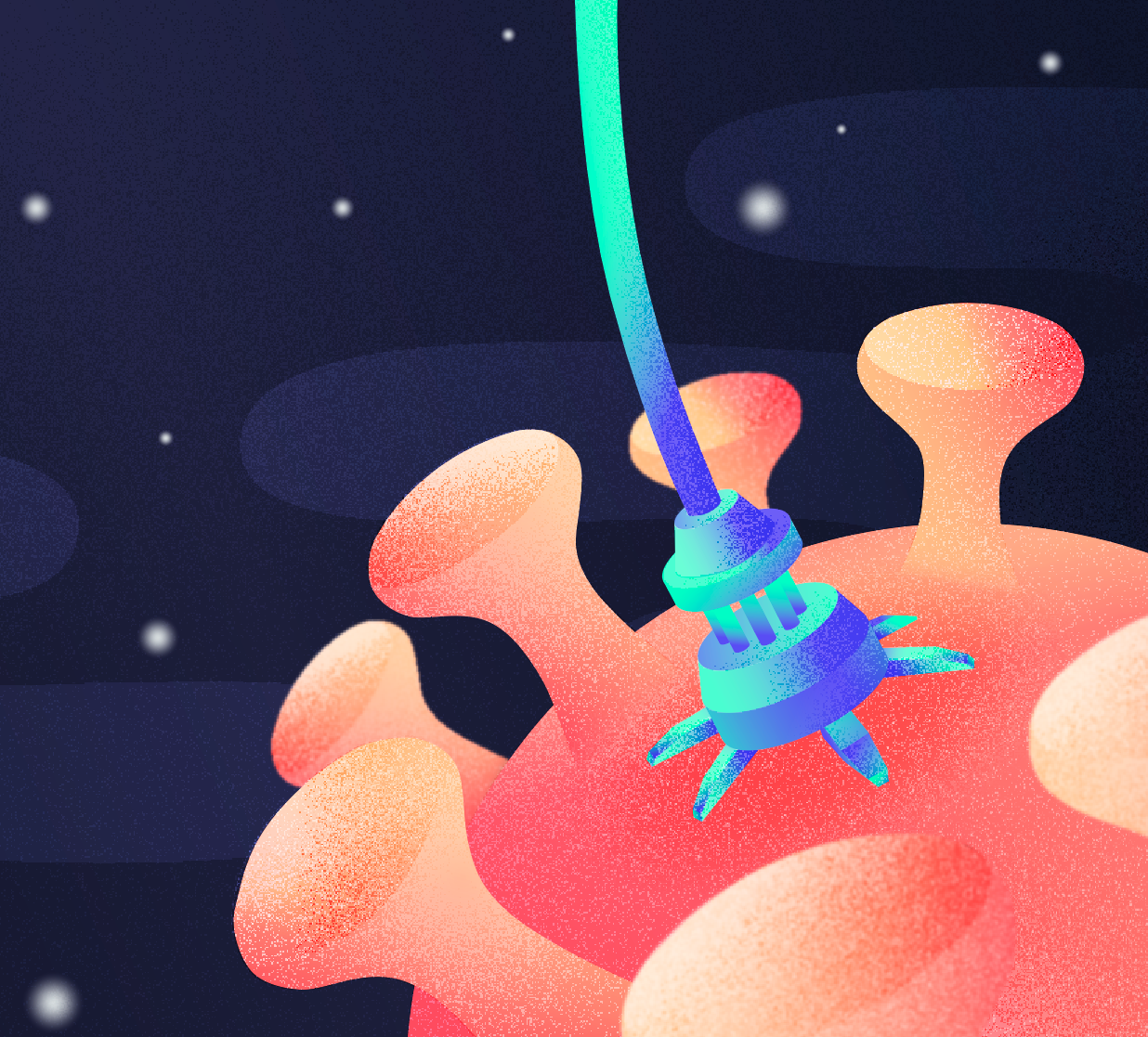
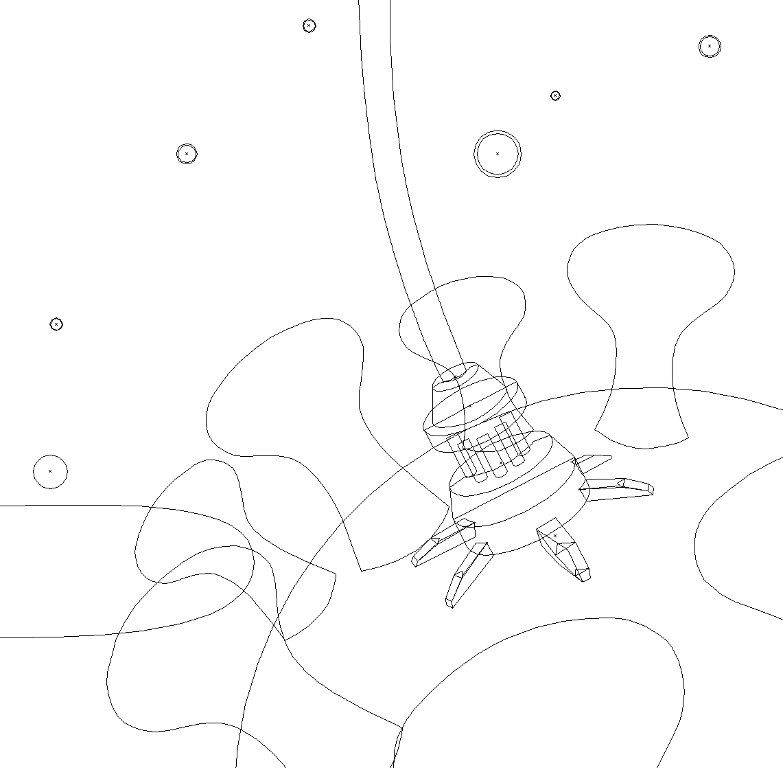
In this illustration, the light source comes from the top. After creating the basic shapes, we can start applying the colour gradient from top to bottom (see Step 2).
Step 2: Adding the colour gradient
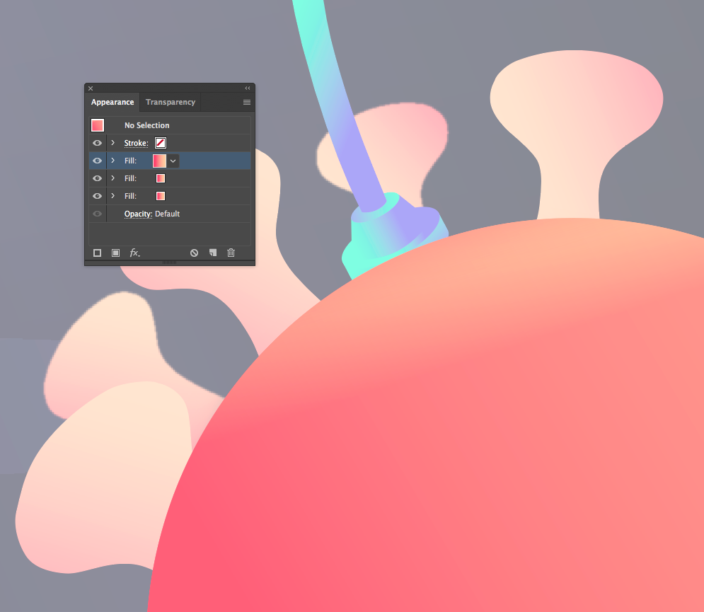
Before applying the gradient, you should first ensure the objects in your scene have proper contrast. A large contrast in colour helps to identify the main elements at a glance and guides the audience in reading the scene. In this illustration, your eyes will first pay attention to the neon blue machine, then to the coral-coloured virus, and lastly to the dark blue background.
To enrich the depth of the colour, you can add or mix colour gradients in the appearance panel. You can also mix in colours themselves with different blending modes and opacities.
Step 3: Applying the grain effect
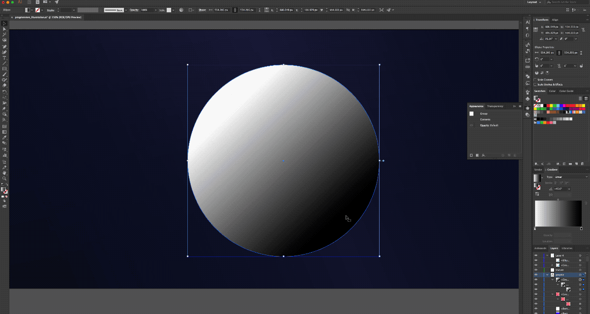
The small details obtained with the grain effect is essential for this type of illustration. It really amplifies this retro look and makes the final result look gorgeous. In this demonstration, I will show how to apply the grain effect on the coral graphic.
- Duplicate the shape directly above the original
- Apply a black and white gradient on the duplicated shape
- Add the grain effect (Effect > Texture > Grain) to the duplicated shape
Feel free to explore the different grain types. I usually use ‘stippled’, as it creates a strong, fine grain texture. I have also tried ‘sparkles’ before which creates more of a static, fine grain.
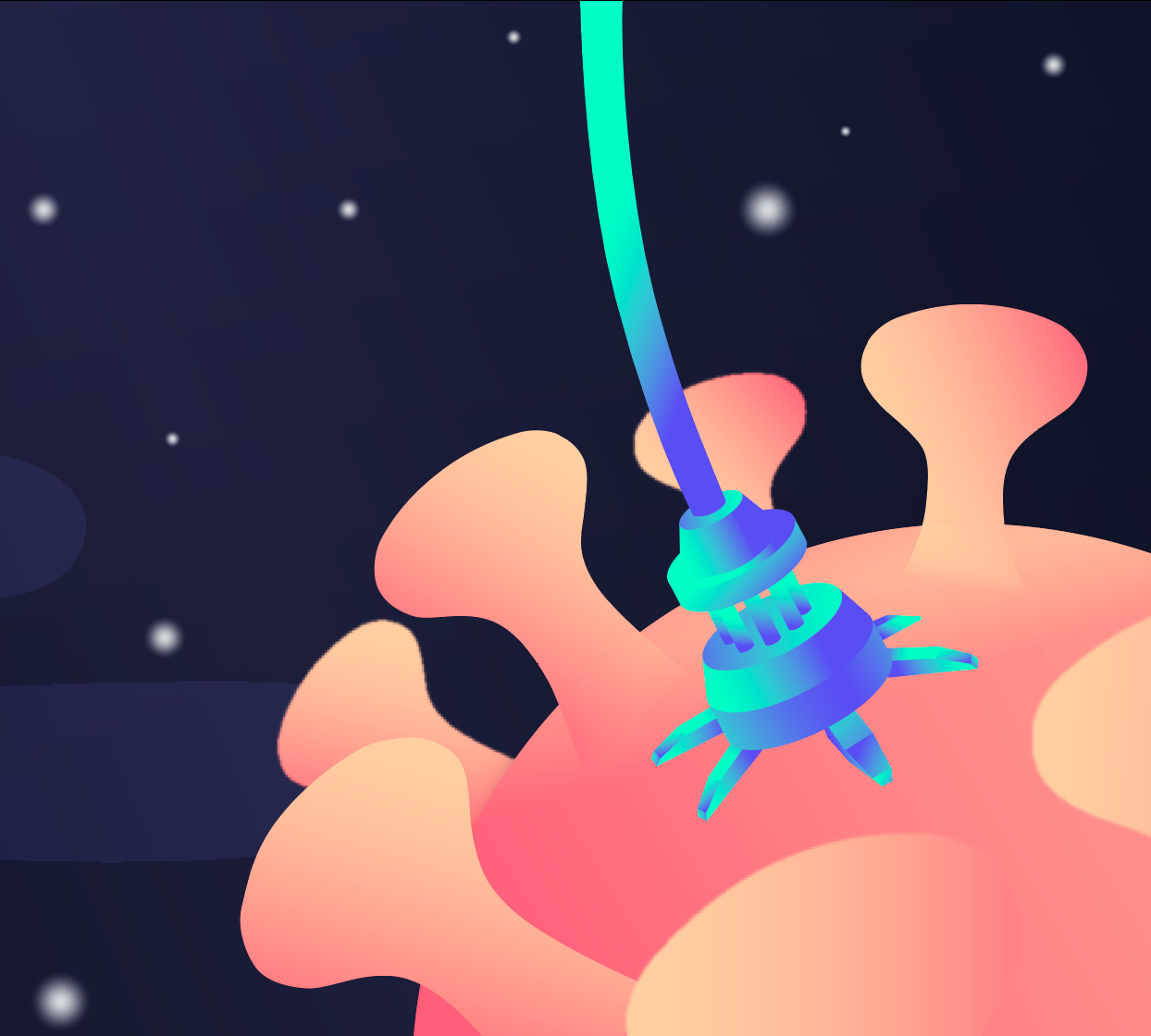
Step 4: Adjust the blending mode
Almost there! Just change the blending mode of the duplicated shape to a 30% Overlay and you’re done! Finish up the rest of the objects in your scene with the above method. Then, fine tune the parameters on everything until you are satisfied with the result. You can also try out different blending modes like colour burn and multiply for other interesting results.
Conclusion
I hope this simple tutorial has been easy-to-follow and can enhance your illustration skills. Of course, there are many different ways to play with the gradient and the grain effect besides just the above method. This is just the tip of the iceberg! Please feel free to explore and unlock your creativity 🙂