Evolving the Grayscale identity
Over the past year, you may have noticed some changes to the way we look—more navy, less purple; more typography, fewer illustrations—that's right, Grayscale is redesigning!

While the most obvious change around here may be the website, this is more than just a new coat of paint. Like any other brand, every physical and digital touchpoint needs to function as part of a connected whole.
At the beginning of last year, we took a step back and re-examined the ethos and goals of the company. Only with a solid understanding of ourselves and a vision for the future could we discuss the implications of a redesign. We needed to consider how clients encounter Grayscale at every stage of our design process, from website to business card to presentation deck.
But first, let’s step into the time machine
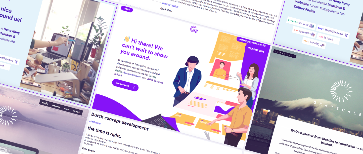
Grayscale is no stranger to timely brand updates, having worn a few different styles since our founding in 2011. As we established ourselves in the Hong Kong design scene, a strong identity became more and more important.
Recognising our strengths and aspirations
Higher education
After a decade of existence, our small team sat down to determine how to portray the company and hopefully plan for the next 10 years. Looking back, Grayscale has gravitated towards the education sector, starting with CUHK’s MA in Global Communication and HKU’s Department of Sociology in 2014, to our most recent redesigns of CUHK’s Business School, and CityU’s Department of Physics and College of Business—as well as small one-off projects like an AR project that merged technology and local knowledge into an impressive learning experience, or a student-powered map of medieval pilgrimages for an art history course at HKU.
Accessible web design
Grayscale has always strove to build accessible digital products—meaning products that, to the best of our ability do not exclude those browsing the web with different mental and physical capabilities. In practice, this means we observe colour contrast guidelines, minimum type size recommendations, the ability to browse sites with keyboard only, and compassion for the kind of people most likely to use our sites. Unfortunately, these considerations are rarely top-of-mind for cash-strapped clients, despite statistics showing again and again that impairments are more common than one might think.
While we’d love for clients to wake up to this ethical reality overnight, we know it’s a long-term effort. But not an impossible one! Early on in Grayscale’s career, responsive web design was just taking off among American designers, but it was another agonising half a decade or so before it became an established practice in Hong Kong. Nowadays, it’s barely a question that a client’s site will adapt to whatever device someone uses to visit. If such a turnaround can happen with responsive web design, it can happen with accessibility, too. And if that means going a little over-hours on some projects to show its advantages, then so be it.
Making your concept matter
With these considerations in mind, the team put our heads together and brainstormed up a statement to guide the company and the next step of the redesign. Our history, work ethic, aspirations… everything that makes Grayscale, Grayscale:
Your concept matters, and it’s our mission to help you realise it. Over the years, organisations big and small like Cathay Pacific, Sealy, and WeLend have trusted us to bring the best design and development solution to life. Together with you, our diverse team of curious folks will go beyond the brief to understand your situation, ask the right questions, and deliver experiences tailored to your demographics.
Putting design to words
While Grayscale’s former identity relied on playful colours and expansive illustrations, it was spearheaded by a few beloved Grayscalers who’ve since moved on in their careers. In consideration of our current skillset and plans for the future, we began the search for an updated brand direction.
A new type of logo
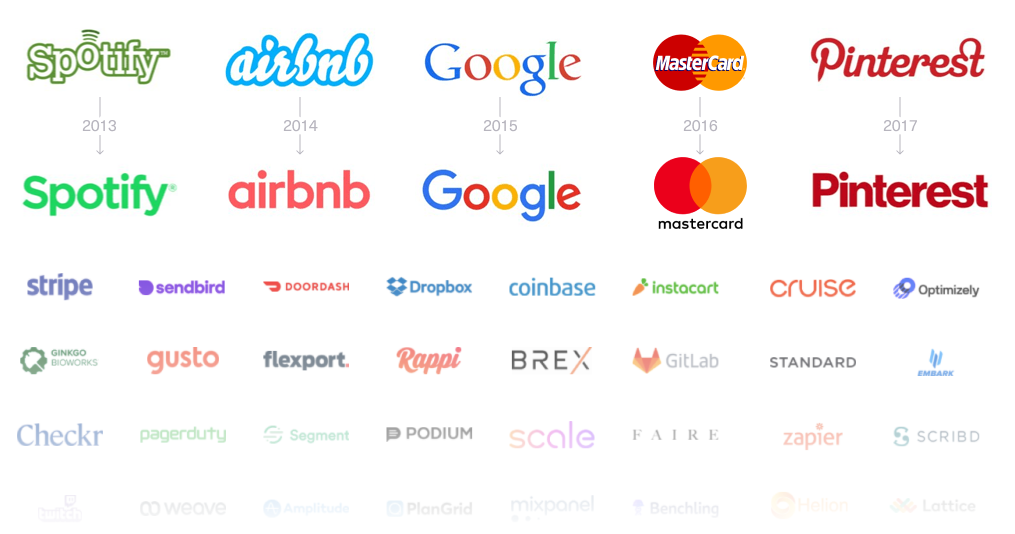
As our developer is also a dabbling type designer with a typeface or two under his belt, it made sense to begin our efforts on that front. Lineto’s Circular had served us well, but among the slew of companies simplifying their logos over the past decade, it no longer stood out as it used to. If we wanted to stay ahead of the trend (at least on a Hong Kong-timescale) and move away from the standard ‘tech company’ look, we would need to make a significant departure.
Enter: Kopius
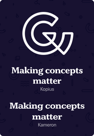
Released in 2016 by foundry Kontour, Kopius gives the Grayscale identity a softer, more human touch. Curved serifs allude to flowing brushstokes and the spacious letterforms convey a general ambiance of openness—just as we’d like to portray ourselves.
An additional consideration for our selection process was that we needed an open-source counterpart for our documents and presentations centralised in Google Workspace to stay as on-brand as possible. This we found in Kameron, a modern re-work of many classic slab-serif specimens.
The Grayscale G

Our distinctive biting-a-pizza logo has been around since 2016. While you may see it less often in bright purple now (unless you visit our office, where it will always be lit up in neon), this is a piece of brand equity we’d not lightly drop from our identity. For this rebrand, we simplified our sometimes-inconsistent application of gradient and shadow for light and dark variants that will work under most circumstances.
Updating the portfolio
Or, how to redesign a site when you’re not getting paid for it
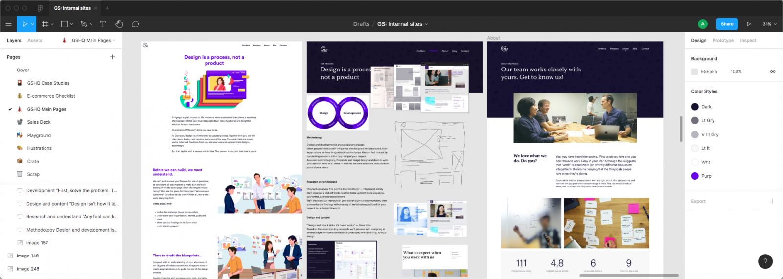
Reworking the site itself was actually quite a different process from our normal client work. Fitting any internal project, let alone a full brand redesign, into an already-packed agency workload is never an easy task. You know that a new site will improve business in the long run, but when there’s always fires to put out for ‘real’ client projects, how could we still manage to relaunch the site in just two months?
- Design in parallel between your design tool of choice and the browser
For the designer, think of your design file as a scrapbook: mock up critical elements of the site as needed and drop screenshots of the live site back in once everyone’s happy with it. For the developer, you don’t always need to wait for the designer to come up with something—if you’ve got a good idea, code first, get feedback later! As messy as this process sounds, it did keep us moving along. - Set a full day per week for internal work only
We know, we know, there’s always client work that feels like it needs priority, but you gotta take some time for yourself. Here, Fridays became ‘Grayscale Days’ for a month or so while we worked on the rebrand. - Know when to say, “Fuck it, we’ll do it live”
Eventually, the site is ready enough and you just gotta put it out there. Our ‘under construction’ flag stuck around for longer than we’d like, but just having the site live was a good motivation to fix all those little remaining issues that otherwise would just drag on and on and on.
And hey, guess what—we’re still not done with the redesign! Part client work-induced procrastination, part living design system, the Grayscale brand identity is still evolving as we work out all the kinks, design new collaterals as needed, and generally just give everything another coat of polish.
We may never truly be ‘done’, but thankfully, we’re able to find the fun in it 🥳
Business cards & other collateral
While the website may be the first point of contact for potential clients, it’s not the only step in the process. Meeting a client? Gotta have a business card! Sending over contracts, presentations, meeting notes? Make sure they’re all aligned!
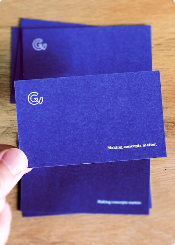
The business card design in particular was a great way to show off some more of our new brand typeface Kopius, as well as a rare opportunity to do some old-school graphic design work and get to know our print shop partners at Willey.
As mentioned earlier, Grayscale is moving much of our documentation to Google Workspace, which meant Keynote out, Google Slides in—an agonising process for a perfectionistic designer, but overall an easier, more centralised solution for both us and our clients.
The last piece of the puzzle
Branding means nothing without the most important piece of the puzzle—you! Otherwise we’re just throwing our beautiful designs into the void.

So if this whole rebranding thing sounds like something you could use, drop us a line! We’d love to have you over to our office and share some of our new business cards (seriously, we printed too many). Cheers!
