Wrap the Feb Up
It’s never too late to say Kung Hei Fat Choy!
We are still (kind of) celebrating the first lunar month of the Year of The Ox and sticking more festive couplets on the office walls. Another thing Team Grayscale loves more than holiday office decorations and closure announcements is a good monthly roundup to review our less-than-precedented agency life.
In this edition of the monthly roundup:
- The never ending D-Biz story
- A new case study for a user research project
- One weird WFH hack
And the D-Biz story just never ends
Reality checked: the first instalment from D-Biz still won’t be ready, even after we’ve finished the technical set-up, performed necessary upgrades, and launched the site… really?

Our clients were delighted to finally sign that funding agreement with the Secretariat before Chinese New Year. But despite the official green light for a project kick-off, they promised the moon again, and failed to disburse the initial payment within 14 working days after the signing of the funding agreement.
Thankfully, our clients were more than happy to settle the bill out of their own pocket after seeing that our work progress had gone well ahead of the government’s disbursement schedule.
Looking ahead… COVID has brought tremendous change to the way we work and live. Even without the funding support, it’s time to re-think your business development strategy and improve your online presence. Grayscale is always here to deliver high-quality websites so if you are interested, contact us today and let’s talk!
Diving deep into our users brains
Taking the first step to kick-start a website project is always the crucial moment—any decisions you make then will lay the groundwork for the design and development phase. Incorporating the user’s vision at the very beginning of the project thus helps ensure we understand the problem right, and decide on solutions which meet both your project goal and the user’s expectations.
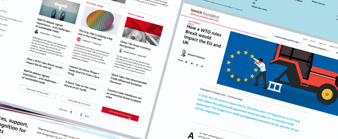
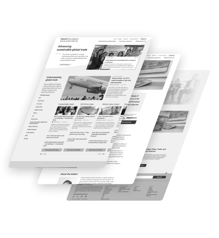
Among our favourite projects, Hinrich Foundation’s user research and UI design project is definitely the most in-depth on the side of user research. This was one which put our research, design, and collaboration skills to the test. We had to ensure the founder’s unique personality shone through, while still letting the needs of the dozens of users we interviewed inform the usability of the new site. In the end, our design language will hopefully further the foundation’s objectives for years into the future.
Let’s see how we addressed the foundation’s brand presence issues by conducting research and prototyping.
WFH VS Office work
Hate to say it, but I do miss the random pantry chat and the unproductive valuable weekly meetings in that physical conference room.
Surprisingly this ambient office noise helps boost my creativity and productivity. (P.S. that Conference Room track is the king.)
Stay safe, and see you in the next edition! 🍀

