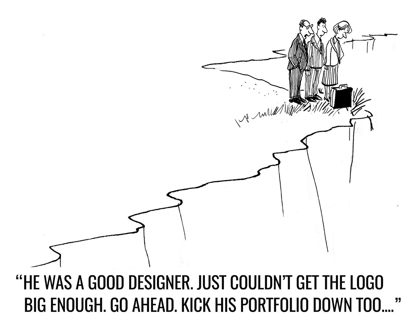
The return of “Make My Logo Bigger”
A revisit of Grayscale's all time favorite blog post.
Eight years has passed since our Grayscale’s design mastermind, David, published the much-loved blog post on logo size (and never second-guessing your plumber). We couldn’t be more ready to re-visit this epic piece, and present a 2023 version of Make My Logo Bigger.
👾: Yanny Chung, Grayscale’s project manager who tries hard to rectify “the bigger the logo, the stronger the brand presence”
🦁: Ashmita Roy, Grayscale’s design lead and recent survivor of the logo size battle
👾: Ash, how do you find the request of “Please make my logo bigger”?
🦁: I feel like retiring to the hills to live a simple life making goat cheese and never thinking of UI/UX ever again.

JK JK.
A part of me wants to make the logo only 1% bigger to maintain my sanity. But the other part of my brain puts on a weak smile and explains in greater detail why the current size has been finalized.
👾: Then how do you strike a balance between “explaining the design rationale” and “being defensive about feedback”?
🦁: “Make my logo bigger” is actually quite a common request. It is, therefore, important to remind yourself as a designer, that 90% of the design thinking happens BTS.
The client is only aware of the final UI. There are countless questions about whether the delicate balance is maintained if the logo and menu items are aligned, about how the eye travels down the page, what the user can notice first hierarchically – the list goes on! These are all part of the process that the client is blissfully unaware of.
👾: “Increasing the logo size helps make my brand pop!” What is your view on that?
🦁: Bigger is not always better! Sometimes a larger logo can end up being too jarring, and distracting from other valuable pieces of information. Most of the time, it’s not about the size of the logo itself – it’s about balance.

This is because very few design choices are simply objectively BAD. It’s usually a matter of context. The bits and pieces that exist around the logo – they exist in a delicate balance. That’s all we’re asking you to consider.
👾: But then how can the logo pop in your design?
🦁: Instead of using a JUMBO SIZED LOGO, there are other ways to make your brand more memorable. Some quick pointers could be:
- defining your target personas to design for;
- focusing on effective storytelling;
- ensuring a consistent and cohesive look and feel;
- creating a community that users want to join and return to.
Your clients aren’t visiting your page to buy your logo, so you’d rather have them focus their attention on your merits, offerings and story!
And lastly, an ill-proportioned, large logo to convey pride in one’s brand can send the wrong message across to your audience.
👾: Any last words to share?
🦁: An important thing to clarify is that we’re NOT married to the idea that small logos are better. A larger logo is valuable in many situations. Deciding when and where is the real challenge!
Key takeaways:
1. A bigger logo is the visual equivalent of shouting at your users. (imagine me standing in Times Square yelling “Grayscale!” at strangers… )
2. Often, a jumbo logo can end up distracting from your message and product, which is the whole reason users are on your website in the first place!