Healthy Octopus: encouraging stair use
Can we improve public health in the Hong Kong metro by using monetary rewards (and a cute octopus)?
Project goals
Walking through the Hong Kong metro system (MTR) early this month, I noticed what is likely a worldwide phenomenon: people will crowd around the entrance to an escalator and wait ages instead of simply taking the nearby stairs. This inspired me to dive into researching not only the psychology behind the issue, but also ramifications on public health and escalator maintenance. Two main goals for this month were:
- Improve public health by encouraging ‘microexercises’ and allow less able-bodied members of society easier access to escalators
- Reduce running of costs of escalators by reducing upward motor strain and lengthen time between servicing periods
Research and behaviour
Public health
Moving up the stairs under one’s own power obviously burns more calories than an equivalent ride on the escalator, but how many?
An 80kg (175 lb.) person burns about 21 calories during a two-minute stair climb. Standing still on a 60-second escalator ride burns about 2.
👉 livestrong.com
This amount is small, considering a recommended daily intake of around 2200 kcals. However, Hong Kong very vertical, so these few calories add up over the course of a day transiting from skyscraper to street to subway and back again.

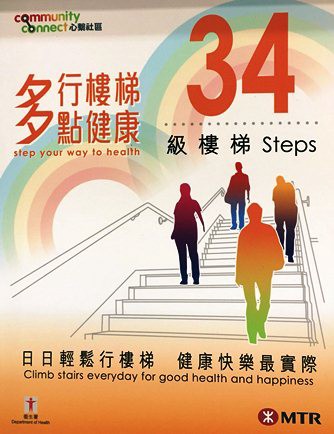
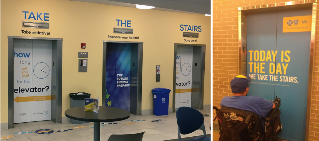
MTR and the Department of Health hang posters extolling the virtues of taking the stairs at stairwell entrances, but these aren’t very encouraging due to low visibility and vague benefits. Stating the amount of stairs is perhaps not as impactful as the amount of calories burned.
Additionally, many stairs may be underused precisely due to their proximity to escalators. One study found that only by vastly increasing the distance to an escalator in relation to the stairs could an increase in use of the stairs be found (Choosing Between Stairs and Escalator.)
Disability concerns
Another public health issue I discovered is how less able-bodied people interact with stairs, escalators, and campaigns surrounding them.

Disabilities are not always visible. It’s the wrong move to always label the “easier” route as an unhealthy choice.
This is a perspective I had not even considered before starting my research. Public health initiatives can often appear overzealous and offensive to those who are physically or mentally incapable of taking the stairs. At worst, it can inspire shaming of those without visible disabilities. The takeaway? Positive reinforcement of healthy habits (see Piano Stairs) is better than negative reinforcement of perceived lazy or unhealthy ones.
Energy and wear reduction
Escalator motors are always located at the top. That means that each additional passenger riding up causes it to work a little harder. On the other hand, riding an escalator down actually helps the motor, meaning the ideal situation is to take the stairs up and ride the escalator down (ie. the opposite of what people generally do).
Another possible concern is the timing of use. In MTR stations, traffic flows downward at a fairly even rate as people make their way to the trains. Upward-flowing traffic, however, ebbs and flows as large groups leave each departing train. Helping to even out that upward flow could reduce strain over time.
Cost savings as motivation

MTR Fare Saver kiosks (seen above) have been implemented around Hong Kong. These machines allow one to scan their Octopus (metro) card to receive a 2 HKD (0.25 USD) discount on their next journey. I’ve noticed that even this seemingly trivial amount will cause people to line up for minutes at a time. Could small cost savings motivate people to climb stairs, too?
Defining features and functions
After two weeks of general research, I was a little overwhelmed, so I put the problem to the 5 whys to make sure I was still on the right track.
The results:
Commuters want to reduce physical effort and are unmotivated by health issues, while decision-makers don’t see the benefit to maintenance and public health of a loss-generating system inside of stations
From the two domains identified above, I decided to focus on the public-facing part, as this was just a simple, month-long thought experiment.
Reward generation
Since noticing how well-used the Fare Saver machines are, I adapted that concept within the stations to provide a reward directly to stair climbers. My concept machines would be placed in the middle of a set of stairs (to combat cheating) and provide rewards proportional to the amount of stairs climbed. For example, if the value of a stair is set at 2 cents, an 80-stair staircase would give a reward of 1.60 HKD.
Emotional interaction
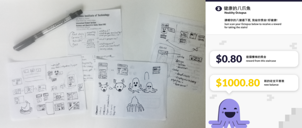
I took advantage of the fact that the majority of MTR-users have RFID Octopus cards to structure my design around a standard kiosk with a scanner as input and a screen and speaker as output. Here, I departed from the emotionless, text-based designs currently used throughout MTR interfaces. Interactions with such systems happen very quickly, as people tap their card on the sensor as they walk by, yet first-time users still need unobtrusive on-boarding.

To bring a breath of fresh air to this quick interaction, I sketched out some designs featuring a conversational design with an avatar for the new service. I made a very simple octopus whose expression changes based on the states of the machine: resting, successful transfer, card read error, and user trying to scan again too soon. Hopefully, this little guy could at least bring a smile to some stressed commuters’ faces.

Prototyping
I had some RFID cards and readers at my disposal, so I decided to mock up a simple web app to model this interaction method. It had been a while since I had last done any coding, so I made sure to keep things as simple as possible.

The RFID reader acts as keyboard input, so version 1 was simply a form with the main input auto-focused. As soon as the card is scanned, a code is inputted and submitted, then looked up in a database. If it has not been scanned yet, the reward is added to the stored value and displayed. If it has already been scanned, it displays an error.

Once the proof-of-concept was working, I took it a bit further and developed the conversation-based GUI I had sketched out earlier. Version 2 now featured the animated octopus along with a simple templating system to push messages in above its head.

Pseudocode for v2 (above) card_list:
card_list:
  cardA = [ID, userBalance, wasScanned]
  cardB = [ID, userBalance, wasScanned]
  cardC = [ID, userBalance, wasScanned]
  ⋮
message_template:
  userBalance placeholder
  textEN[success, error]
  textZH[success, error]

submit.onclick = function() {
  currentReward = totalStairs * stairValue;
  currentUser = input.value;

  for (var i=0; i<card_list.length; i++) {
    if (wasScanned = TRUE) {
      create error message_template;
      appendChild(message_template);
    } else if (card[i] == currentUser) {
      userBalance += currentReward;
      create success message_template;
      appendChild(message_template);
    }

    setTimeout(function() {
      input.reset();
    }, 2000);
  }
}
Post Mortem
Additional features
It would be interesting to expand this concept out into some form of a game, where the number of steps would add up over time, allowing people to reach milestones and receive rewards. Or, it could be cross promoted with some type of mobile game (Pokémon Go? Mario Runner??) to offer in-game rewards for real world activity. As it stands now, however, the technology behind the Octopus cards doesn’t allow for more than the current balance to be stored.
Coding skills
I felt very limited in my approach to coding the prototypes above. All I used was simple HTML, CSS and vanilla Javascript. I know there are prototyping systems and boilerplates that would’ve gotten me where I wanted to be much easier, but I just don’t have any experience with any of them and always fall back to the basics. Next time I’d like to try working with something like Framer.js or Origami.
(This article was originally posted on Medium.)
