The importance of shape in web design
When it comes to web design, the use of shapes can be a powerful tool to create visually appealing and effective websites.
Shapes can convey different meanings and emotions, and they can be used to organise information, guide the user’s eye, and create a sense of balance and harmony in the design.
Two major categories of shapes used in web design are geometric shapes and organic shapes.
Geometric or Organic?
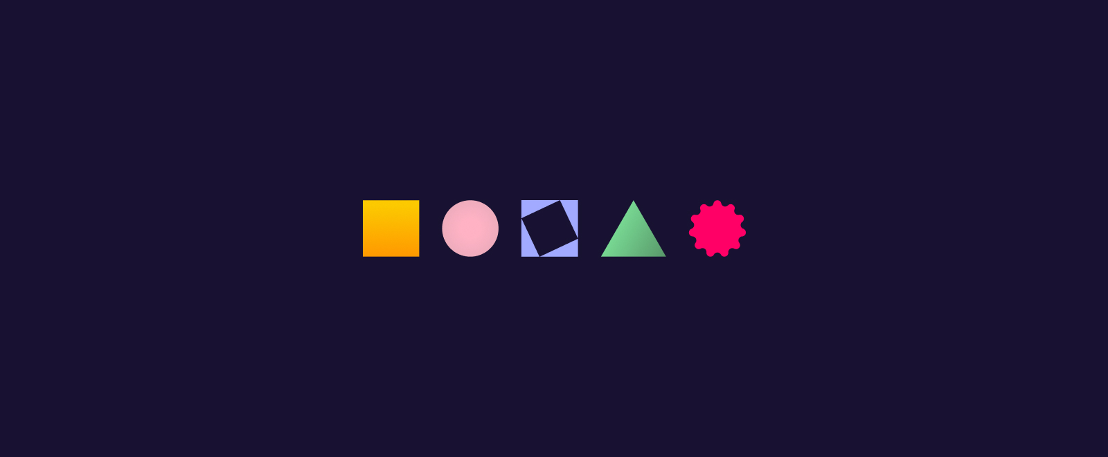
Geometric shapes are defined by mathematical formulas and have regular, symmetrical patterns. Examples of geometric shapes include circles, squares, triangles, and rectangles. Straight, clean lines are also an element considered to be geometric. Geometric shapes are often associated with order, stability, and precision. They can be used to create a sense of structure and balance in a design, and are particularly useful for creating grids and layouts.
Organic shapes, on the other hand, are shapes that are irregular, asymmetrical, and often found in nature. Organic shapes are usually associated with freedom, movement, and naturalness. They can be used to create a sense of flow and movement in a design, and are particularly useful for creating a sense of depth and texture.
Making the right choice
Both geometric and organic shapes have their own strengths and benefits, and they can be used in different ways to achieve different design goals. We have put together a list of some factors to consider when choosing between geometric and organic shapes in web design:
1️⃣ Brand identity

The choice of shapes should be consistent with your brand identity and values.
A tech company, for instance, that values precision and innovation, may use geometric shapes to convey a sense of order and structure. On the other hand, a natural products company may use more organic shapes to convey a sense of naturalness and authenticity.
2️⃣ Tone and mood

The choice of shapes should reflect the tone and mood that the website is aiming to achieve.
A website selling luxury products may use geometric shapes to convey elegance and sophistication, while a website promoting something more like adventure travel may use organic shapes to convey excitement and movement. The tone and mood of a website relies on a lot more than language, as shapes indicate the feel at first glance.
3️⃣ Content and functionality

The choice of shapes should be aligned closely with the content and functionality of your site.
If you choose to present a large amount of data or statistics, you may opt for geometric shapes to keep the information organised, understandable, and create a sense of clarity and efficiency. A more creative site with a focus on showcasing the arts, design or other similar ideas may benefit more from organic shapes to portray creativity and expressiveness.
4️⃣ User experience

The choice of shapes should both enhance the user experience and facilitate navigation.
For example, geometric shapes can be used to create clear and distinct buttons and easy-to-recognise icons, while organic shapes can be used to create visual cues and pathways that guide the user’s eye and create a sense of flow.
Why not both?
In web design, the use of shapes is not limited to just one category; as mentioned above, all shapes have their own strengths, so you don’t need to limit yourself. In fact, the combination of geometric and organic shapes can create a visually dynamic and engaging design.
Your website may use a geometric grid layout with organic shapes overlaid on top to create a sense of depth and texture. Or a website may use a combination of geometric and organic shapes to create a sense of contrast and balance.
If you prefer to stick with one or the other, it is important to consider, when choosing between geometric and organic shapes, the context and purpose of the website, as well as the user experience and brand identity. Both organic and geometric can be useful tools in web design, and the choice between them should be based on your specific design goals and requirements.
The use of shapes in web design is a powerful tool that can create a visually appealing and effective website. Geometric shapes and organic shapes are two major categories of shapes that can be used to achieve different design goals.
Get in touch with us to discuss your brand requirements and how we can help you create your perfect website.
