What? A web conference in Hong Kong?
Find out what happened at the first annual Webconf.asia, a conference in Hong Kong for anyone who makes anything on the web.
When did that happen?
If you’re someone who builds websites and the month of June uneventfully passed you by, then you clearly missed out on Webconf.asia.
On the second and third of June, I was racking my brain for out-of-the-box solutions at an all-day responsive design workshop, trying to remember details about application protocols I last looked at in freshman year, and overall being immersed in a deluge of new ideas from the diverse lineup of speakers.
Who was there?
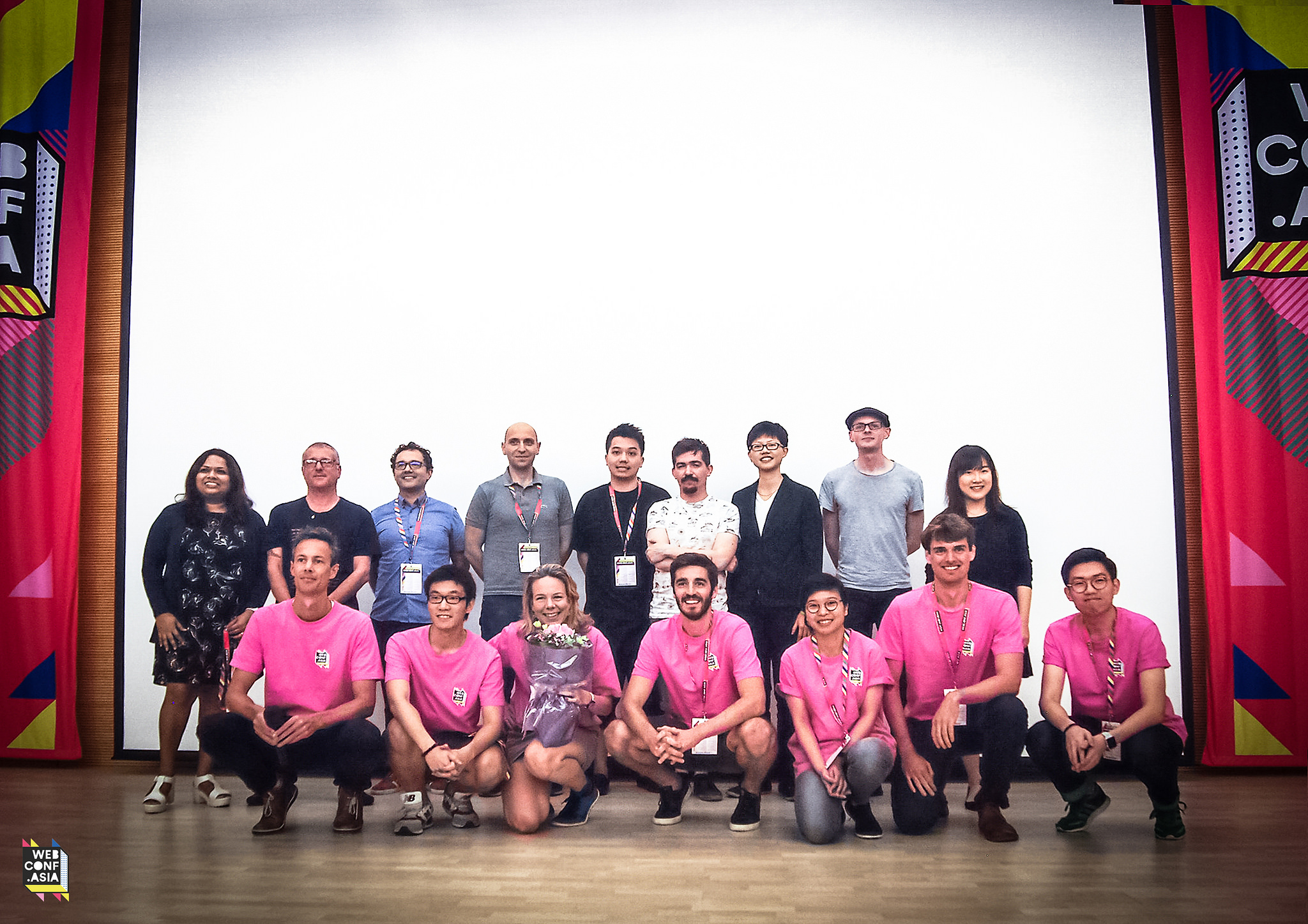
Webconf.asia was organised by Charis Rooda, a freelancer and conference junkie who successfully strove for as much diversity as possible in the disproportionally white male-dominated conference scene.
Vitaly Friedman: Editor-in-Chief, Smashing Magazine
Ran a whirlwind day-long responsive design workshop forcing us to design with absurd content and time constraints to really push for unique solutions.
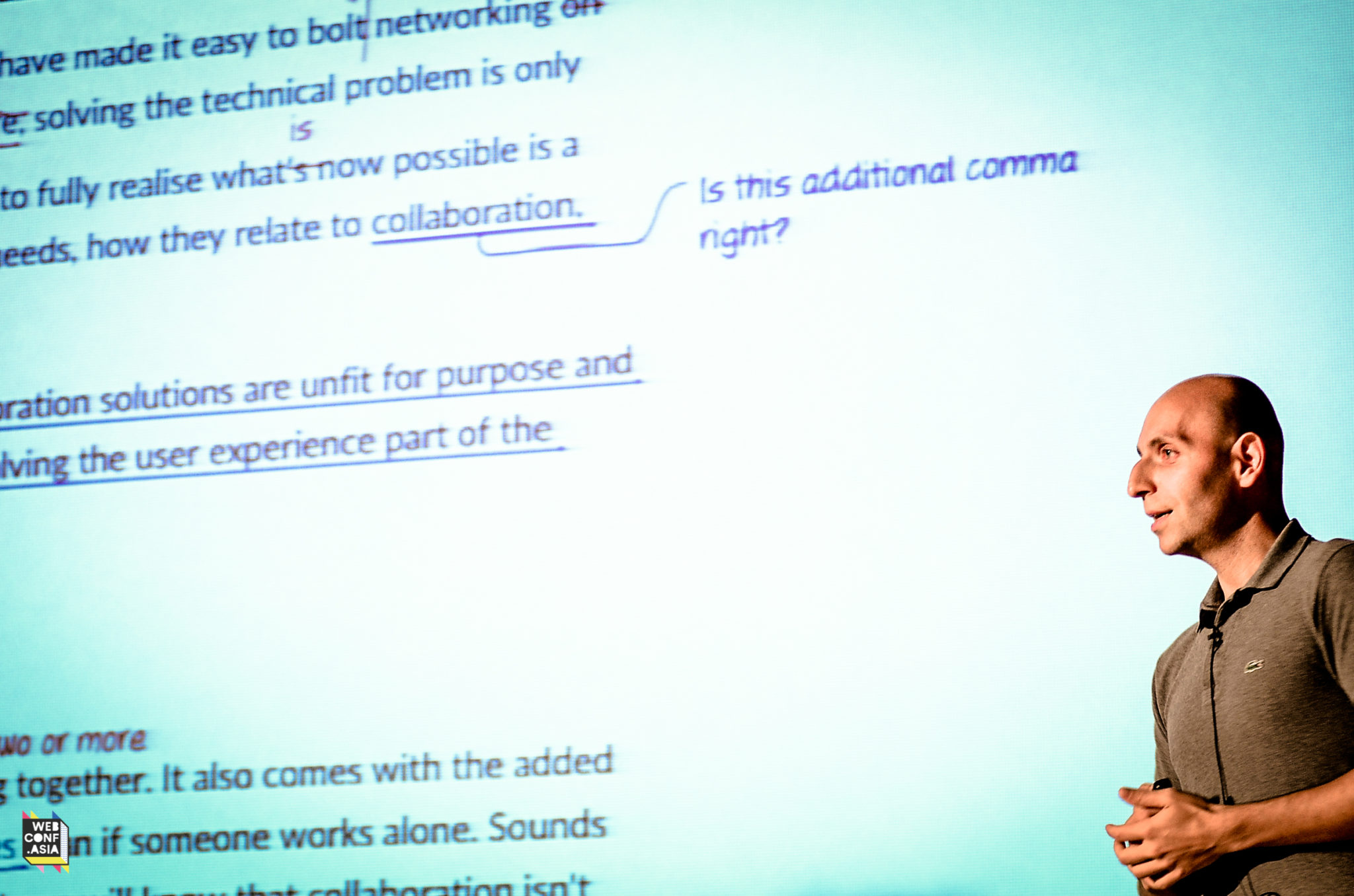
Andrew Betts: Principal Developer Advocate, Fastly
Super developer-focussed, but I did learn that web apps can now take advantage of a Vibration API (or restrict it with Feature Policy)!
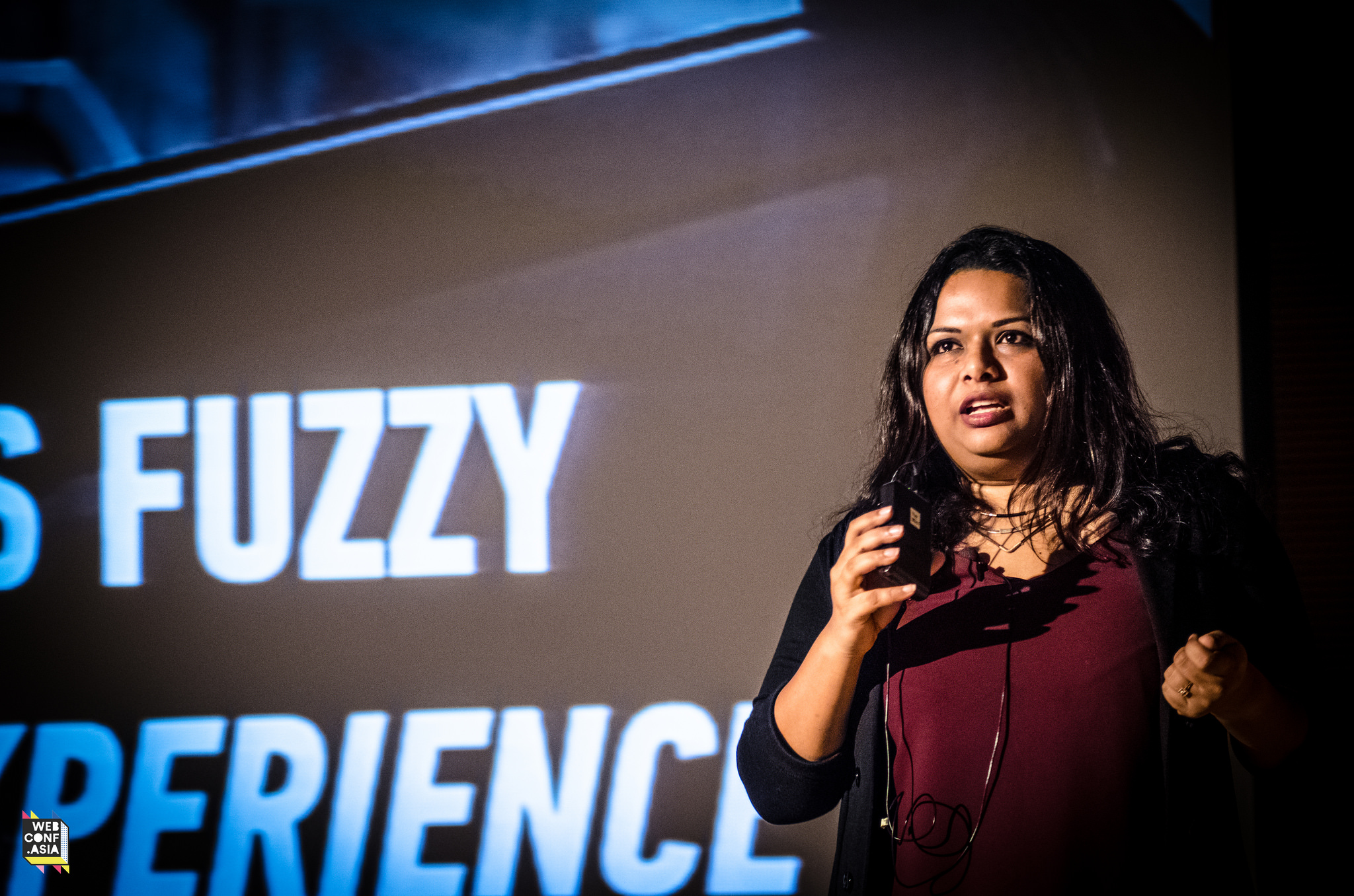
Madhura Chavan: Project Manager, Google HK
It’s always helpful to be reminded that UX is not just what you see on the screen, but everything affecting your users’ situations. Your boss might not always see it this way, though…
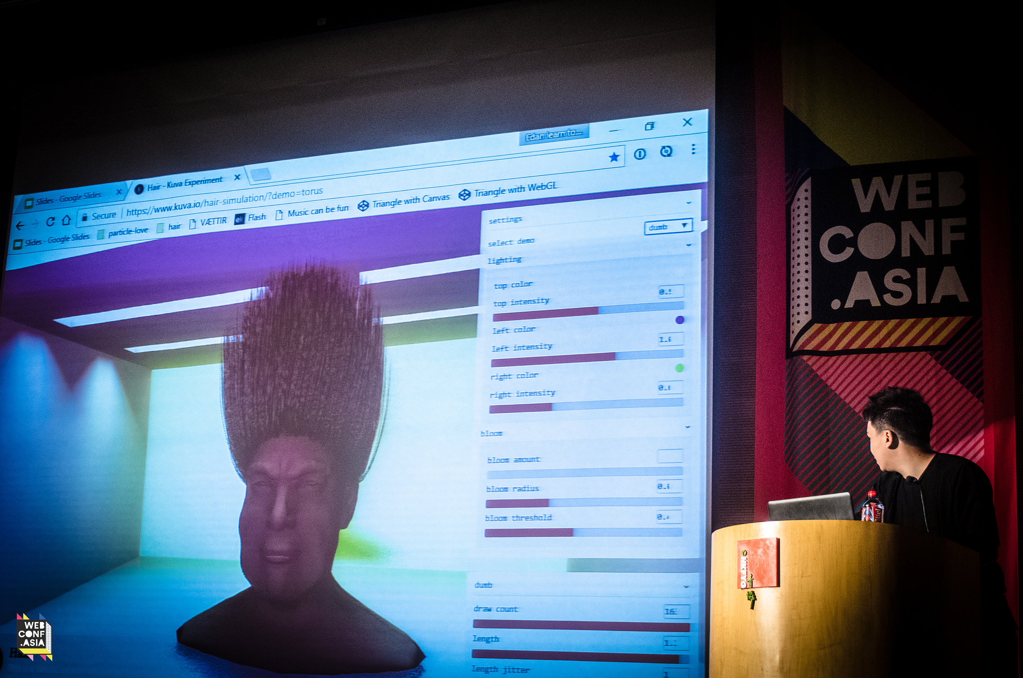
Edan Kwan: Co-founder, Kuva
His portfolio of experimental, generative 3D web projects made me consider how I could move my 3D skills into the browser. Someday, I’ll get to playing around with A-Frame…
Dietrich Ayala: Technical Evangelist, Mozilla
Nobody’s downloading apps, so take advantage of novel interactions and open-source tech and to bridge the physical/digital divide! His live demo of use-cases for an AR web app was eye-opening!
Hui Jing Chen: Web Developer & Typography Expert
A great talk for anyone designing with Chinese characters, she dove deep into East Asian typography and pointed out some developments to keep tabs on, like CSS logical-properties.
Bruce Lawson: Webstandards Lovegod at Wix
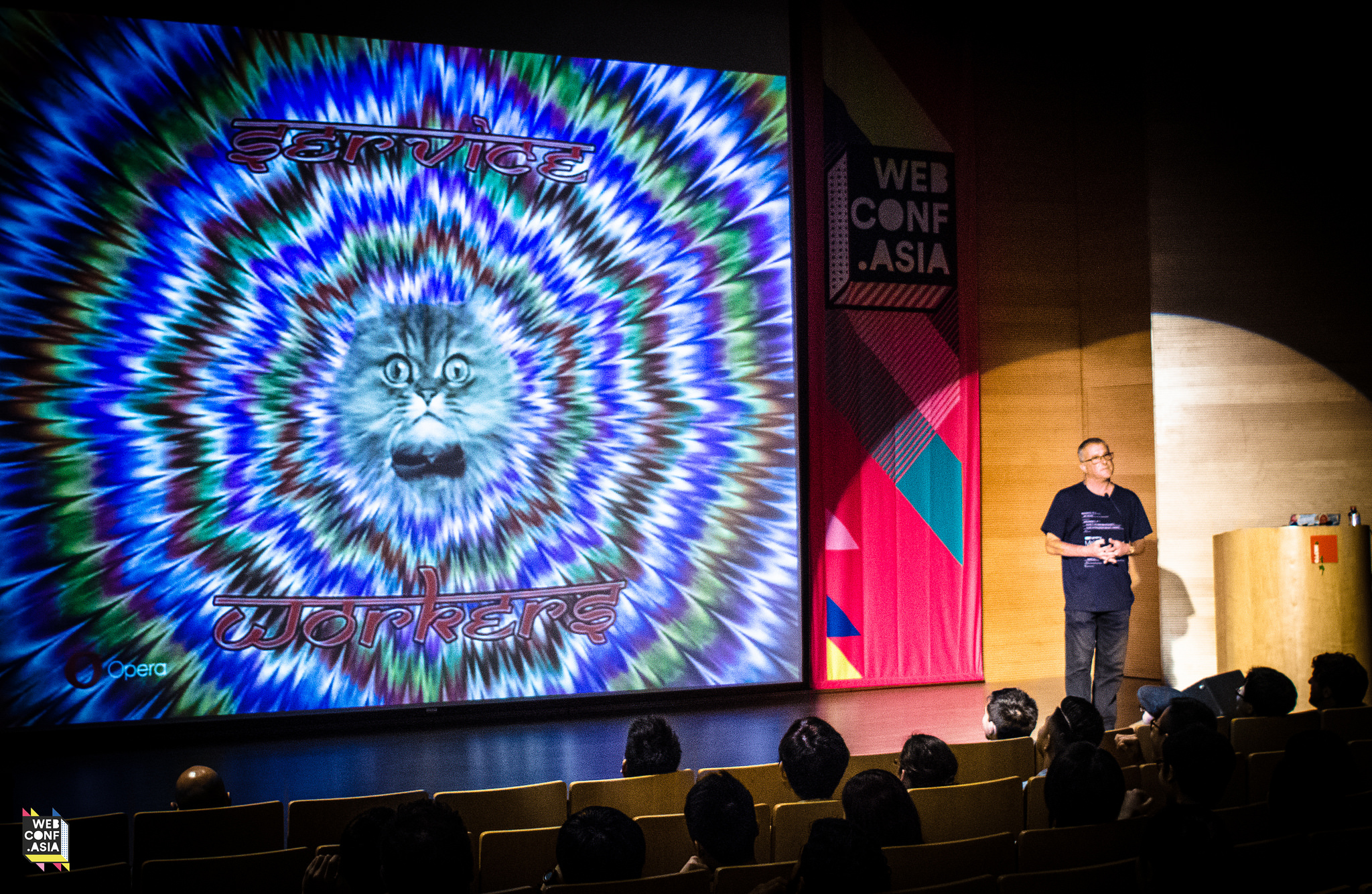
How do we design for the next 4 billion? Provide locally-relevant content, cater to different skill levels, address unreliable networks, and decide whether you really need to show that 5MB cat gif.
Heydon Pickering: Accessibility Consultant and Designer
A developer-centric, but hilarious way to end the day; we all need to take a step back to make sure we’re not over-engineering our solutions. Less is less. Less is good.
Favourite 1: Vitaly Friedman’s Responsive Web Design Workshop
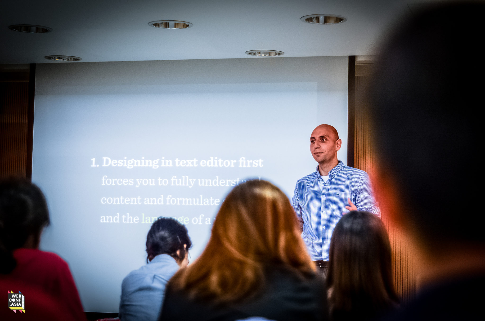
For the Grayscale team and about 30 others, the conference actually began bright and early Friday morning. As we slowly woke up from the Hong Kong humidity, Vitaly introduced a favourite quote of his from a student in Denmark:
If we want to stand out, we need to delight customers with a remarkable design and unique, charming personality with unprecedented attention to detail. Underpromise and overdeliver through outstanding storytelling and great art direction.
Uniqueness vs. design patterns
As web creators, we should always strive to truthfully and uniquely represent the companies and people with whom we work. It’s better for a brand to be loved or hated than for it not to be known at all! But… this doesn’t mean we should entirely eschew design patterns, confusing users in the pursuit of individuality. Rather, we should rely on design patterns to get out of dead ends and save time. And never forget, this is a website we’re designing, not a building, “We can always break things now and repair them later!”
Team challenges!
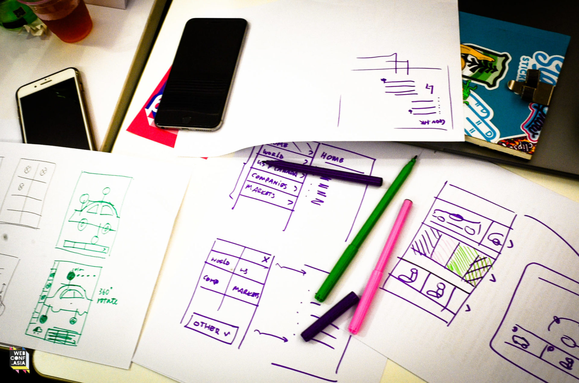
As this was a workshop, we soon got down to business. Teamed up with those around us, I worked with Ethelia to come up with lightning-quick solutions to a wide variety of different tasks. For example, redesigning the gov.hk website (a few laughs here) without using any rectangles or circles (…) in only 3 minutes(😰)! However, from these constraints sprung a surprising number of different solutions. Ours was entirely text-based with type-to-complete search, others were based around svg video masks, navigating a Google Earth view of the city, or even an entirely voice-based interface.
A selection of the other challenges included:
- designing a language switcher and layout for an Icelandic-English-Cyrillic-Arabic-Chinese site
- improving a generic e-commerce carousel
- how to modify a Ferrari customiser tool for small screens
- compressing a conference’s multi-track schedule for mobile use
On delight
Delight is a word thrown around a lot in UX circles nowadays, but Vitaly provided a few great examples on how successfully delightful products look in action. First, he highlighted Mailchimp’s seemingly unrelated marketing campaigns, including producing charming colouring books and giving away figurines of their mascot, Freddie each month. These actions not only increase brand awareness without even mentioning their core product, but just make people happy.
Not all delight has to be warm and fuzzy, though. Hans Brinker Hostel is a notoriously bad hostel in Amsterdam that simply doubled-down on their awfulness in a recent redesign. Their web page is hideous and insulting, their premises are barely up-to-code, but since relaunching, they’ve become a novelty, an attraction of their own right, simply by capitalising on their own negatives.
Wrapping up
After a long day, Vitaly capped it off by making sure to keep perspective on everything we’re doing. Standing in front of the images recorded onto the Voyager Golden Record, he reminded us that we’re not designing for aliens, so don’t over-complicate it all. The web moves extraordinarily fast and creating a site that sticks around for more than a few years is a lifetime achievement. So strive for a unique and representative solution, but don’t think too much!
Favourite 2: Dietrich Ayala on IoT and the digital/physical divide
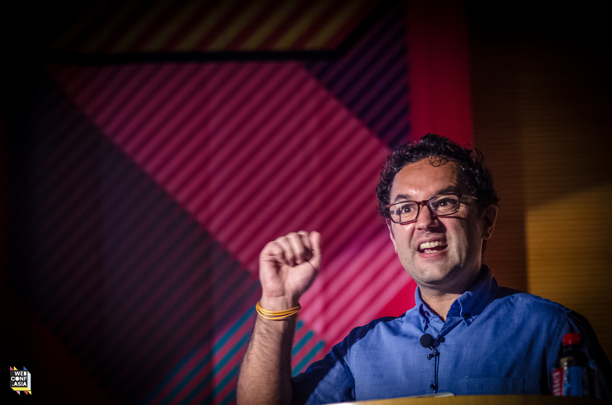
Getting back into the swing of the conference after lunch is always a hard task, but Dietrich’s passionate delivery of open-source and inclusive design solutions kept me awake and interested. Technology is becoming ever more responsive and ever less visible. Bluetooth beacons, standalone voice assistants and smart home technologies are still in their infancies, but will only improve as time goes on. Technological advances are allowing us to identify, understand, and design for the most granular of user situations.
Bridging the digital/physical divide
It’s been a constant struggle since the dawn of the internet: how can we take advantage of people’s physical environment to bring them into a digital experience? Dietrich pointed out some ways in which East Asian cities like Hong Kong are on the forefront of connecting the real world to online information. Anyone living here knows the convenience of using your Octopus for public transit, car parks, store payments, and even building security! Even the oft-ridiculed QR code is widely used for data transfer in apps such as LINE and WeChat, while beautifully stylised ones can be found offering more information around historical areas of the city.
Open, not download
It seems like our honeymoon period with apps is drawing to a close. People are downloading fewer and fewer apps, while at the same time, the likes of WhatsApp, WeChat, and Messenger are consolidating more and more features into the ones people already use. A psychological perspective might say the cognitive load of opening a website is lighter than navigating through a store to download an app. So what’s an app-maker to do?
Enter Progressive Web Apps: app-like websites which can be added to the home screen, be run without browser UI, work offline, and even offer push notifications. Dietrich then passionately explained how we as web creators can take advantage of the many up-and-coming, open-source technologies to deliver rich experiences within the browser, a few of which I’ve listed below.
- getUserMedia() API: prompts a user to allow access to the various abilities of their device
- Payment Request API: a universal design conceived to impart trust in the payment process
- Deeplinking: opening an app that the user (likely) already has installed
- Casual AR: like Pokémon Go, very simple AR implementations can potentially have very large effects; Dietrich showed off nametags to convey a person’s status or preferred pronouns
- A-Frame: A simple way to display 3D content using mainly HTML code
Designing responsibly
But with all this at our disposal, how do we prevent our designs from turning the world into an always-connected, distraction-filled nightmare? That part is up to us. As user experience designers, we should be tackling the scary problems, but we have to make sure we’re responsible in taking advantage of these latest technologies.
Final thoughts
To me, Webconf.asia was well worth the price of admission. The workshop was as tiring as it was energising. The talks were compact and rapid-fire, but thought-provoking all the same. And of course the food was top notch.
Can’t wait until next year!
Webconf.asia took place over two days at the Hong Kong Federation of Youth Groups building in Quarry Bay, Hong Kong. Follow @webconf_asia to keep up to date on next year’s conference, as well as upcoming standalone workshops.
